ASCENTION
Founder, Greta Fitz, wanted to challenge the traditional fragrance experience by pairing her deep spiritual background with her pedigree in prestige fragrance. What came next was a luxe clean fragrance brand with feel-good benefits.
- Brand Identity
- Packaging
- Art Direction
THE VISION
To create a collection of fragrances that help elevate your mind and settle your spirit while tying in key principles of aromatherapy and crystal energy.
PACKAGING
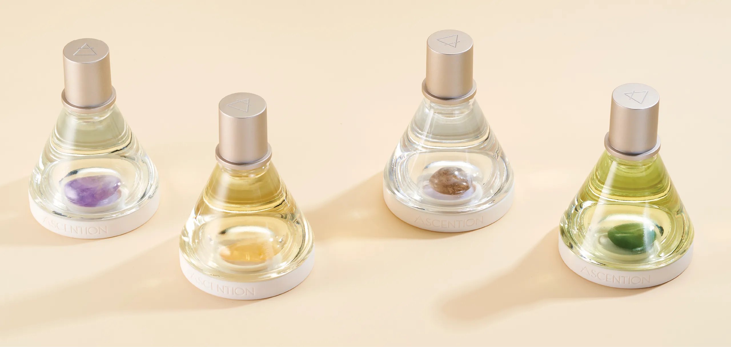
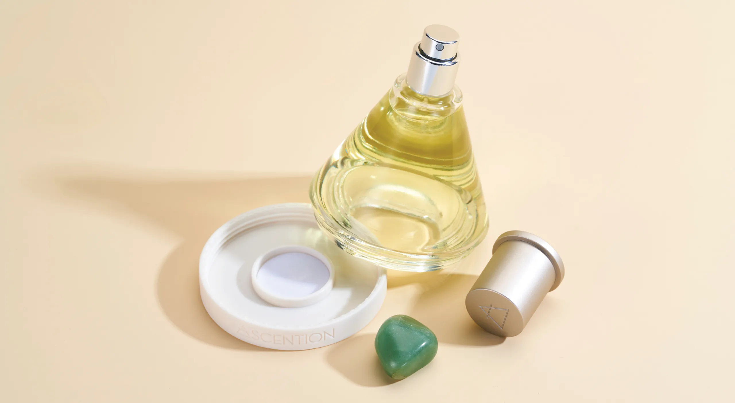
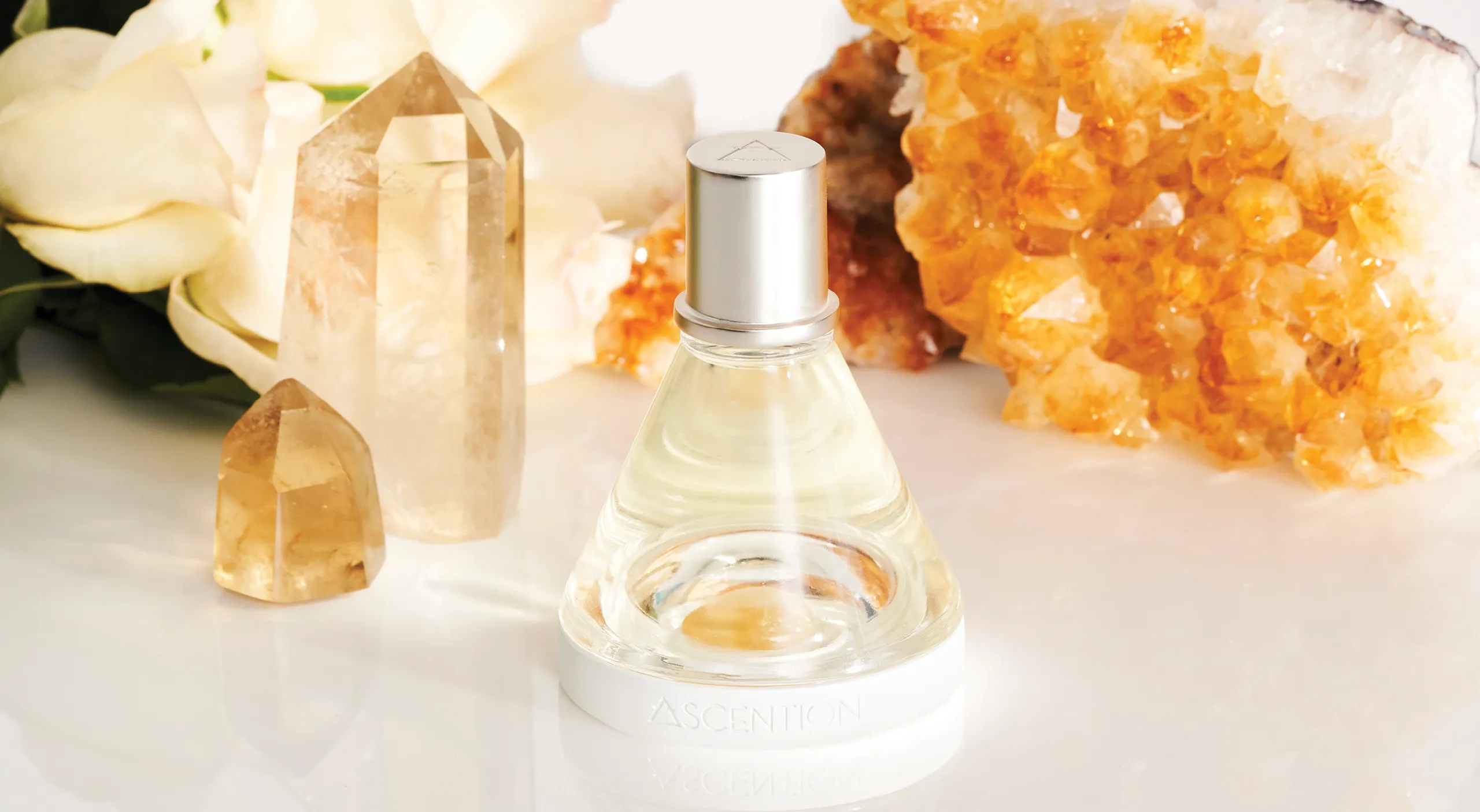
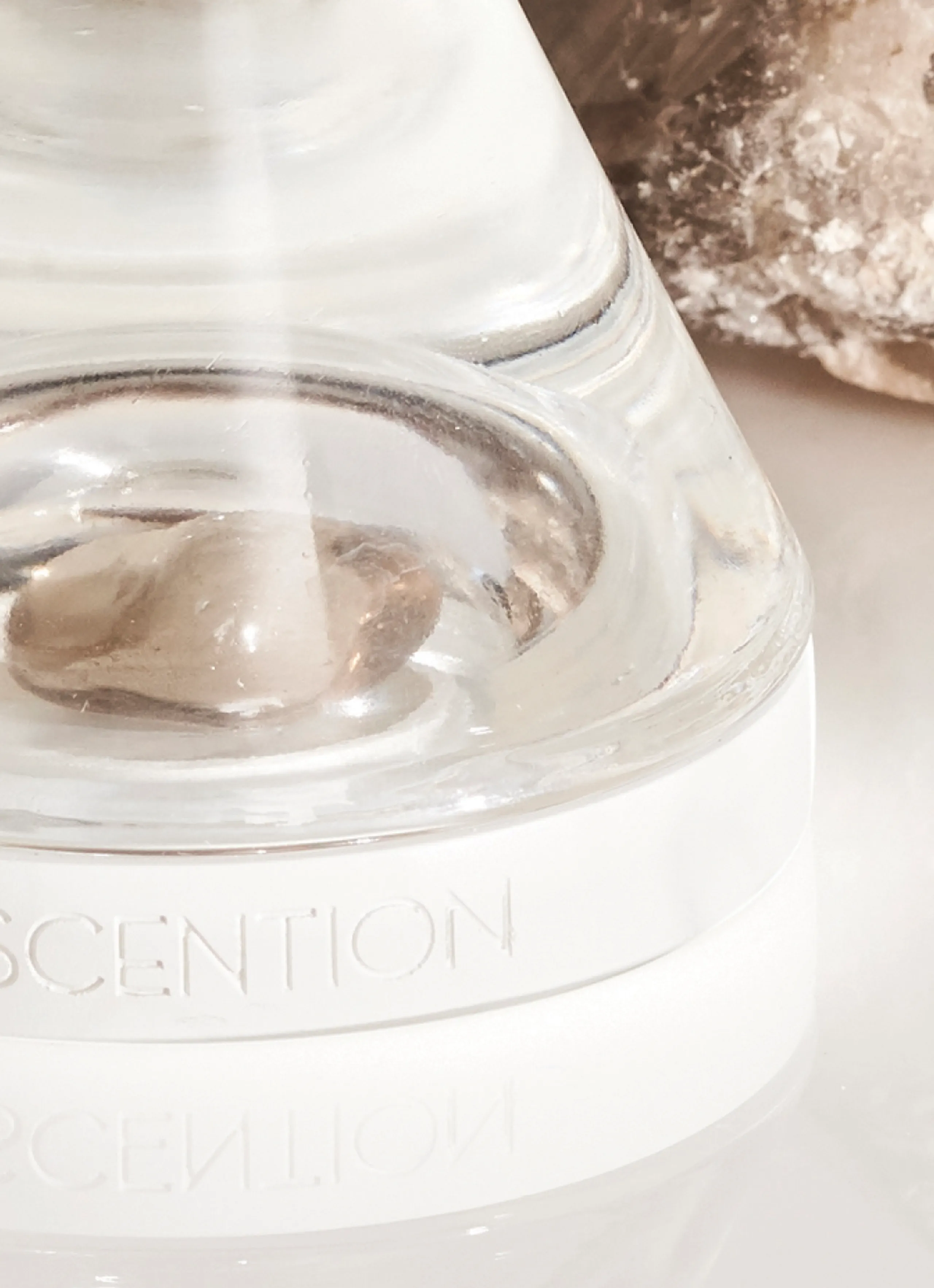
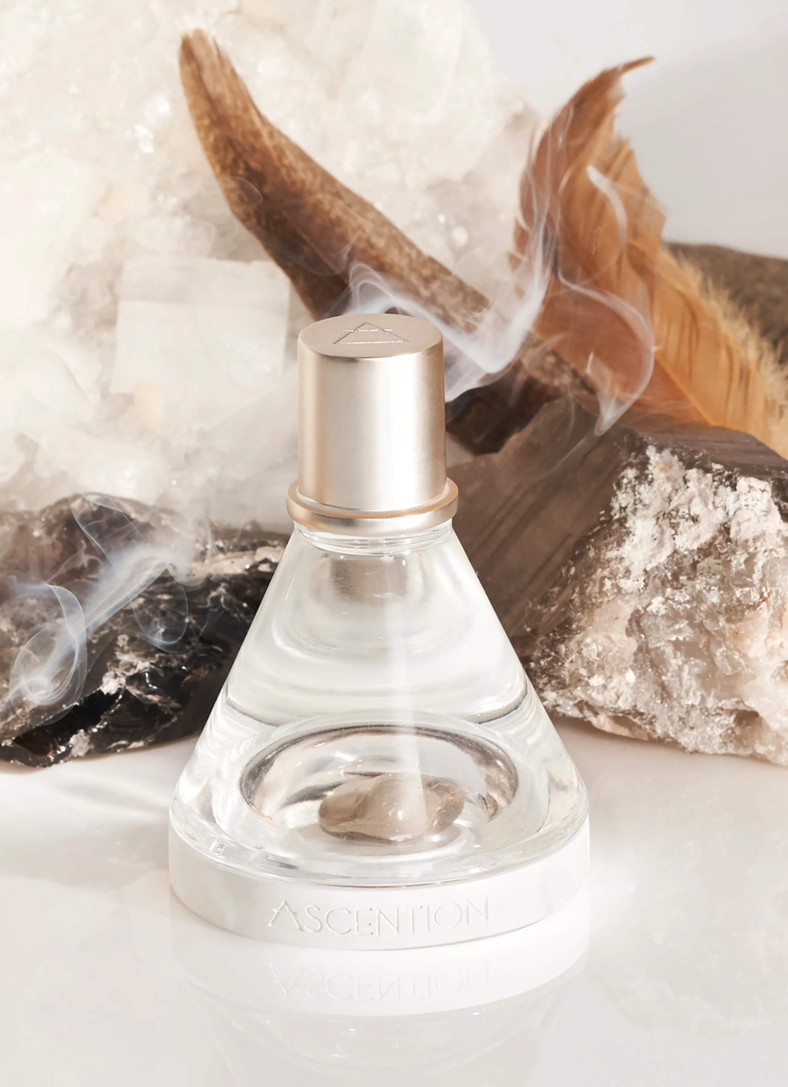
Innovation was key to help drive home the overall brands philosophy. With that we sought out on how to pair the energy of a crystal with the juice itself. Knowing the two couldnt mix in the same space, we designed a two part vessel that housed the crystal at the base and the juice in the upper chamber. Never the two to touch, the idea was that the crystal infused it’s energy and appeared immersed in the fragrance. Each fragrance is paired with its own fair-trade crystal. The glass is shape like a cylindrical cone with a “punt” at the bottom to accommodate the crystal that sits in a white plastic base that can be removed. The stove pipe cap is slightly weighted and finished in a satin neautral metallic champagne color.

LOGO
To acsend is to “rise up”. The brand icon was developed with that in mind. A geometic triangular shape with the line cutting through the top creates a symbol for Ascention. Integrated into the main logo as a replacement for the first letter in the word “A”.

