CLEAN BEAUTY COLLECTIVE
Clean Beauty Collective has been setting the standard for world-class
fragrances since 2003. In 2017 they brought us on as their creative partners and tasked us to do an aesthetic overhaul on the main Clean umbrella brand as well as all of
the existing fragrance sub-brands living under it, all while keeping with it’s core DNA. This included updating
Clean Classic, Clean Reserve and Clean Avant Garden. Over the last five years, we went on to create additional categories including, Clean Home and Hair & Body.
- Brand Identity
- Packaging
- Art Direction
- Campaign
- CONTENT CREATION
THE VISION + PACKAGING CLEAN CLASSIC
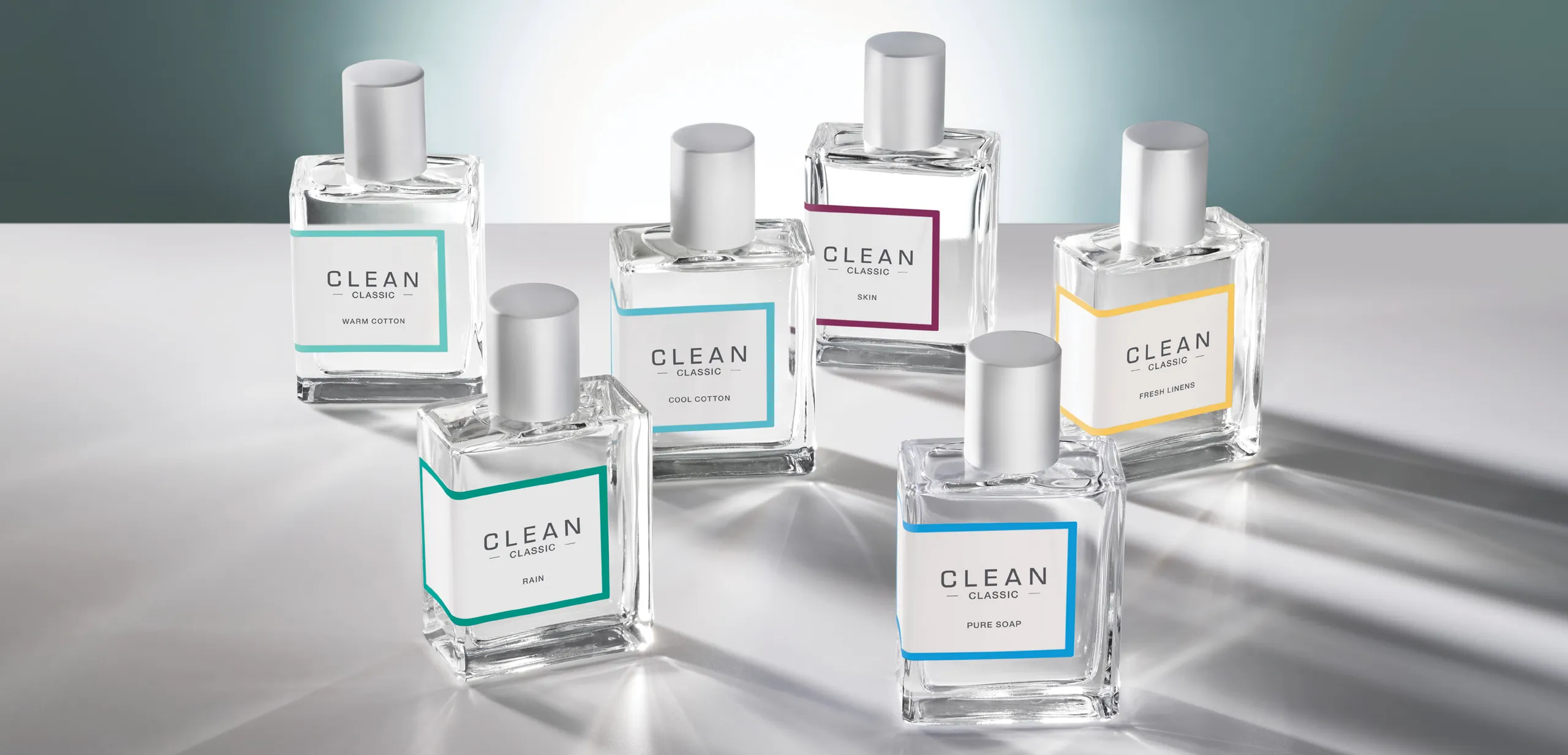
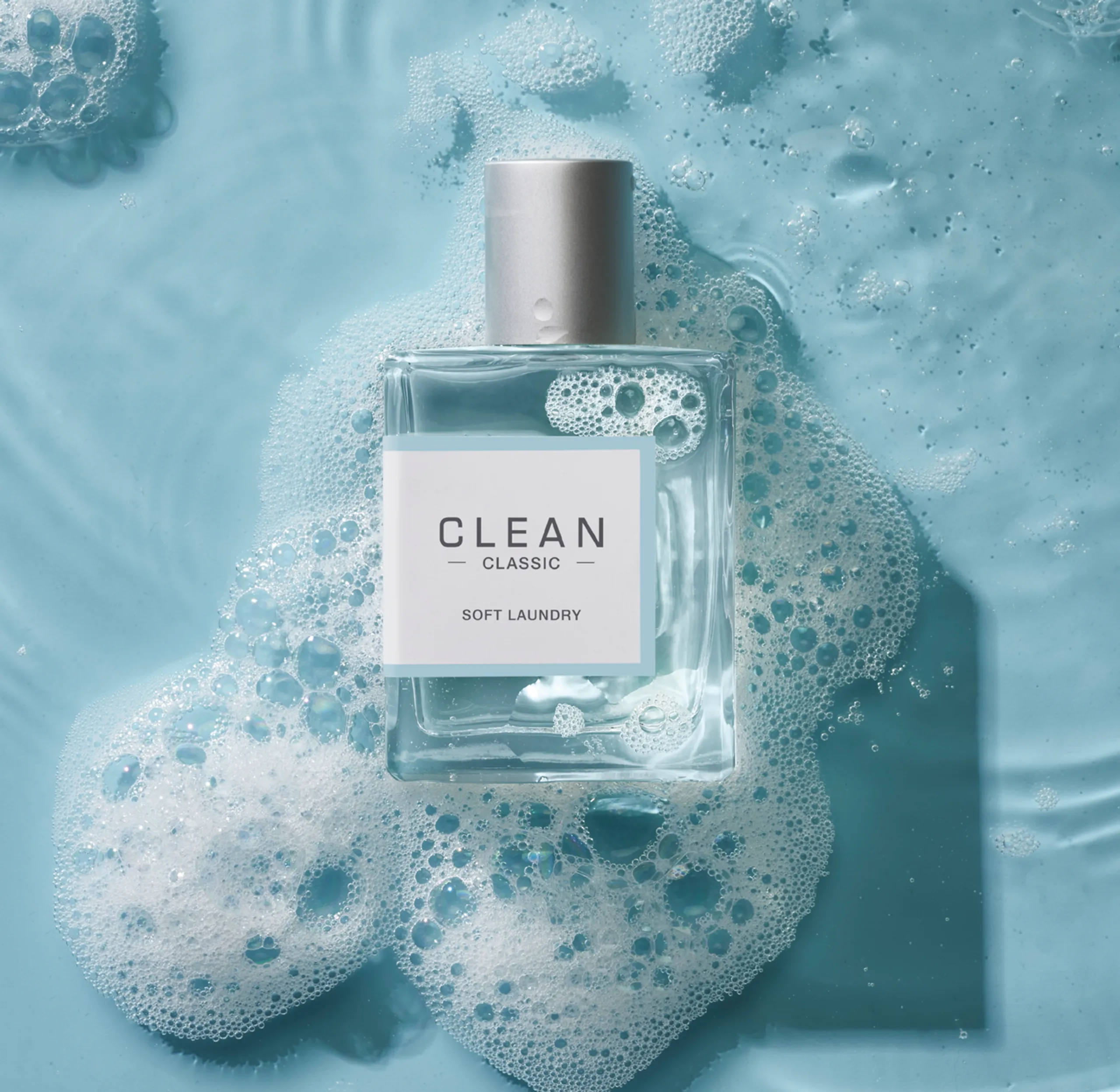
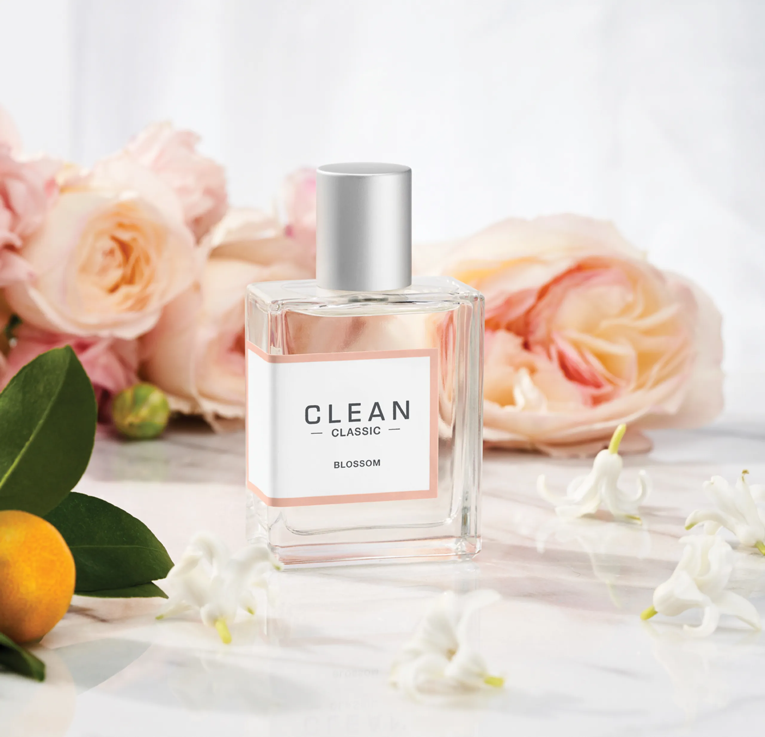
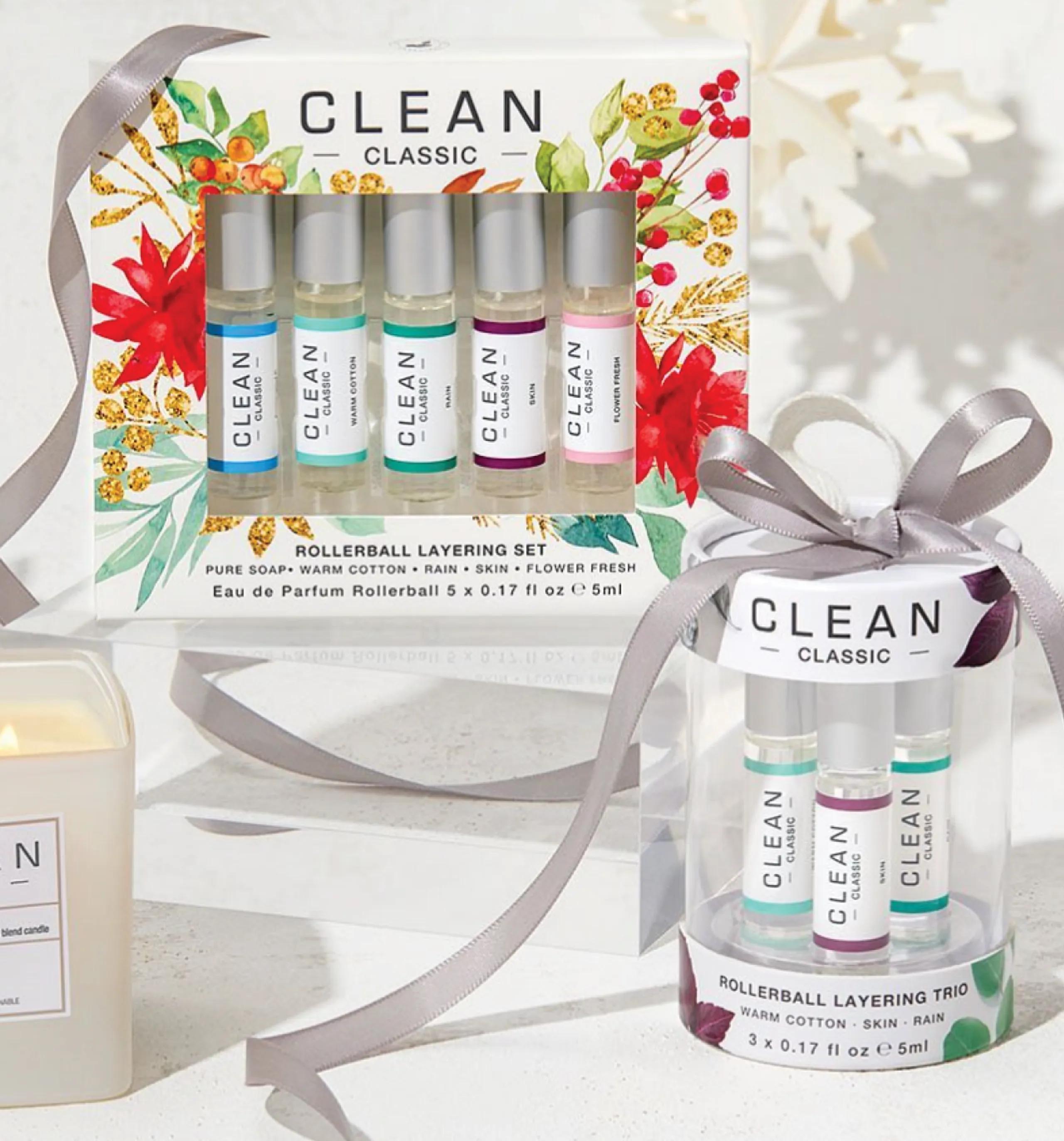
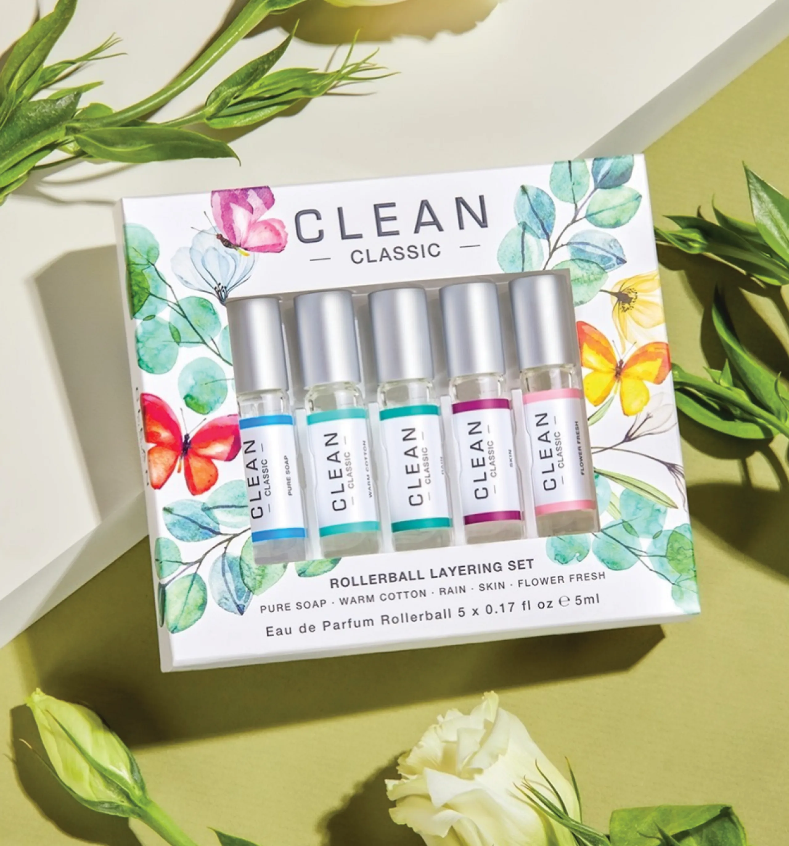
The original fragrances that launched Clean were light, bright and linear fragrances that were meant to portray simplicity with a clean refined look. We updated some of the codes and kept with the refined look for the packaging. Simple square bottles are topped with satin finished caps and are wrapped on the side with clean white labels framed in individual colors signifying the various scents in the collection.
SIMPLE. TRUSTED. CONSCIOUS.
THAT’S THE CLEAN BEAUTY
COLLECTIVE PROMISE.
THE VISION + PACKAGING CLEAN RESERVE
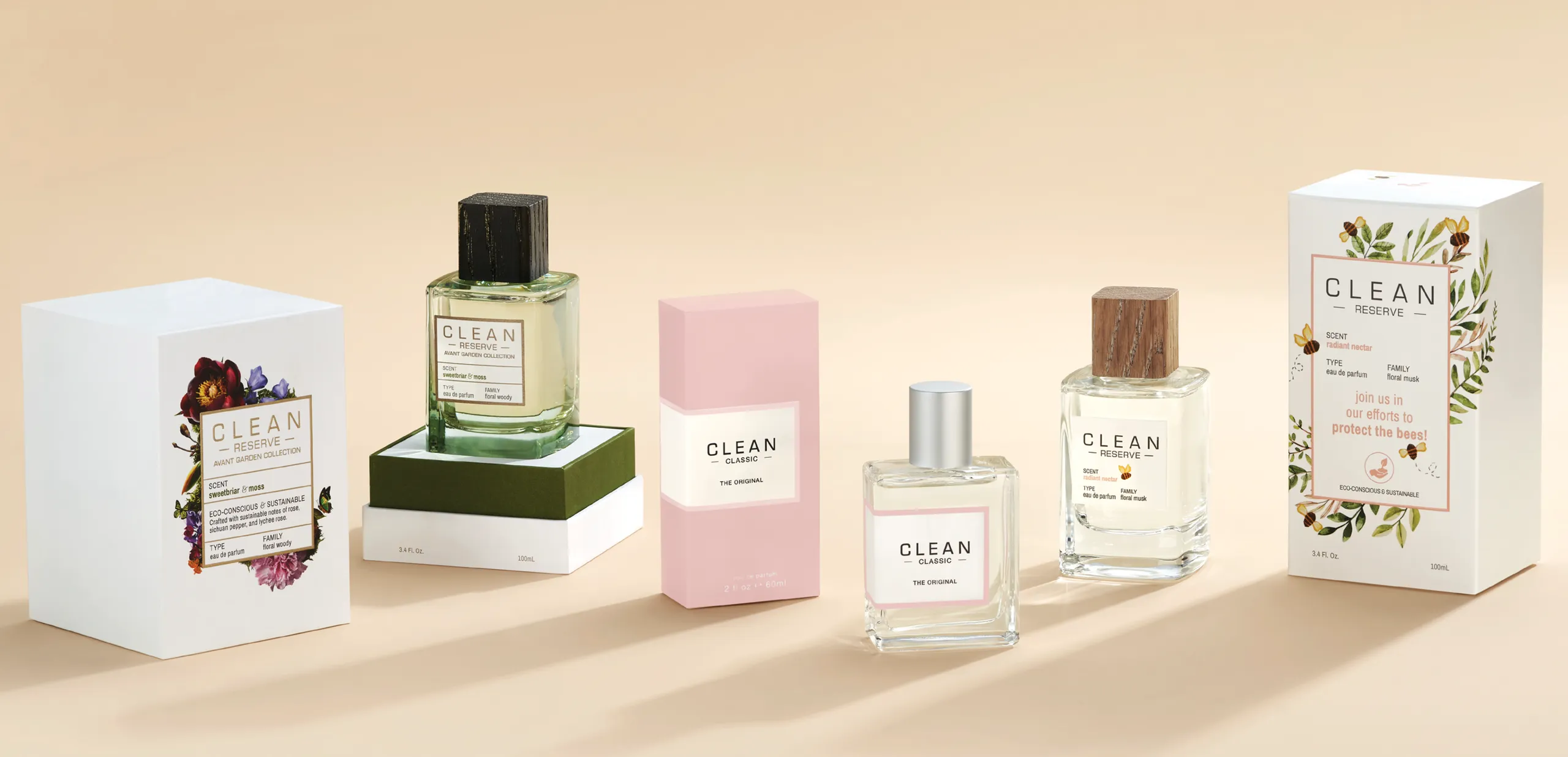
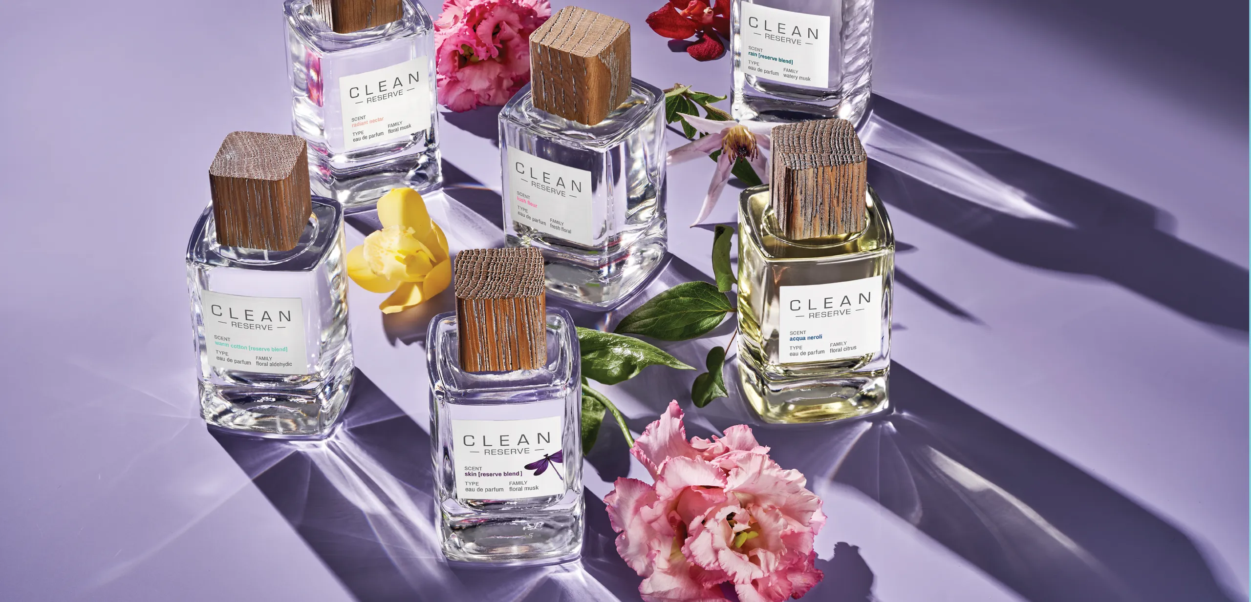
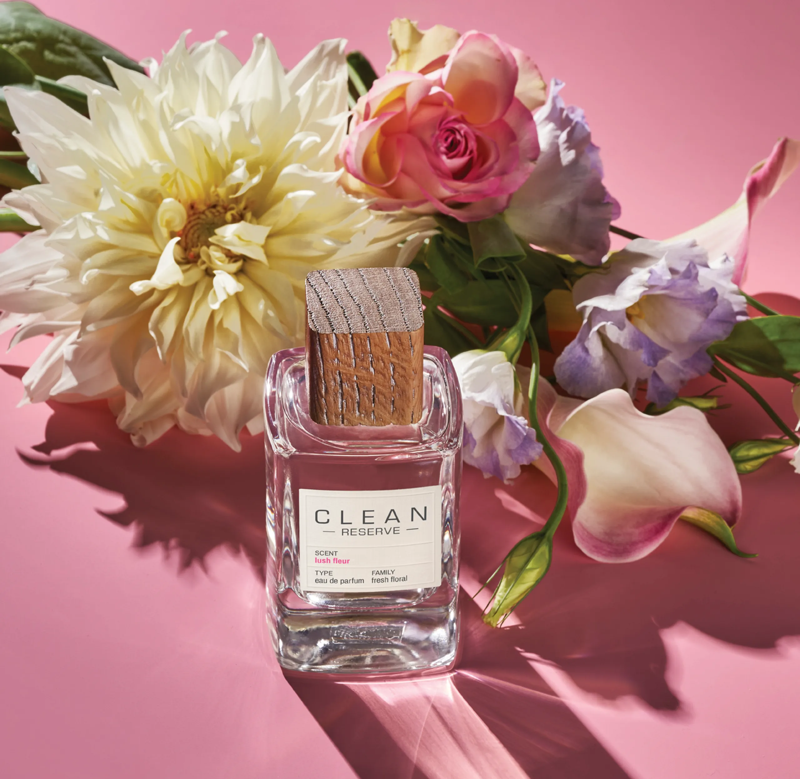
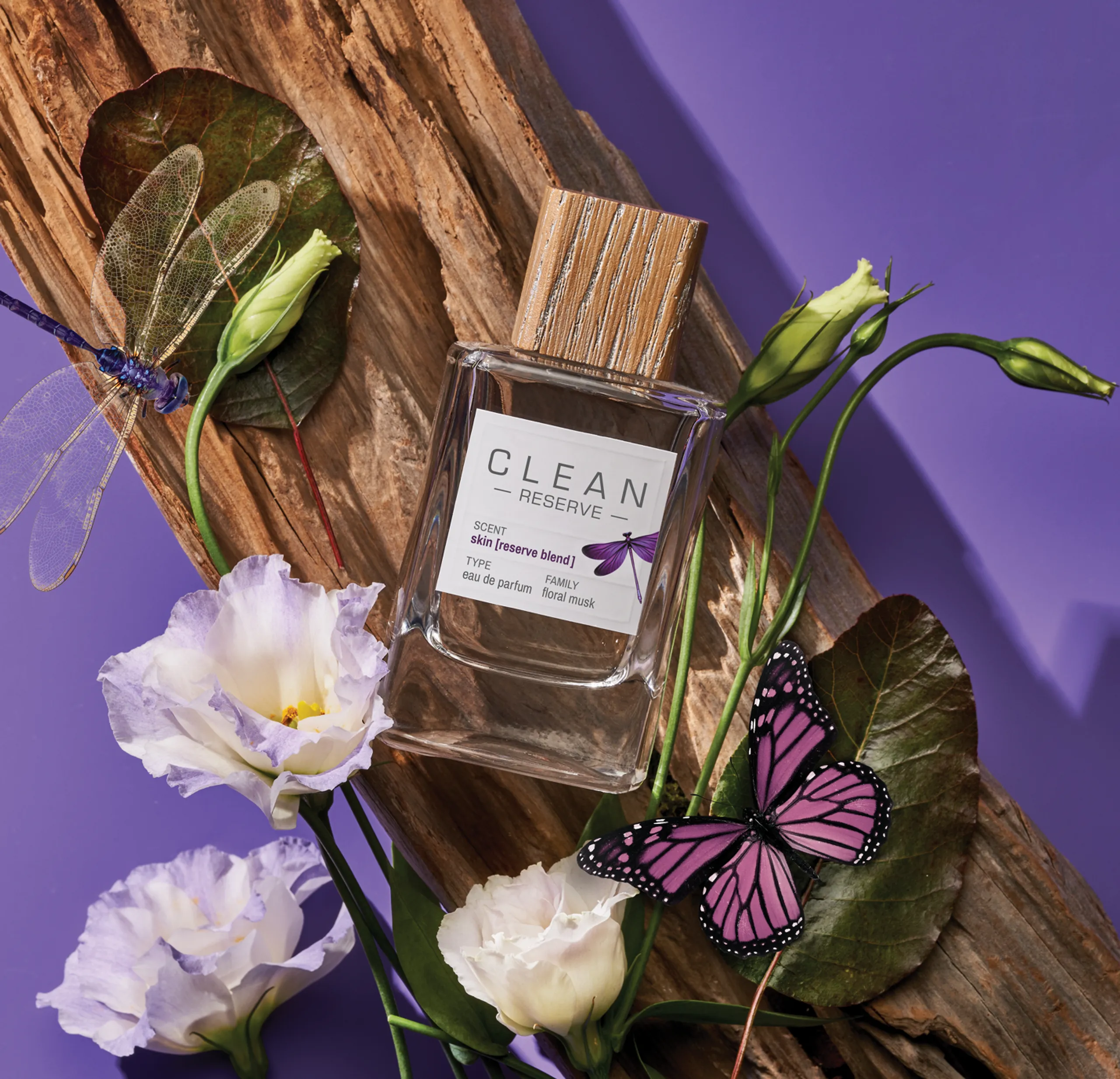
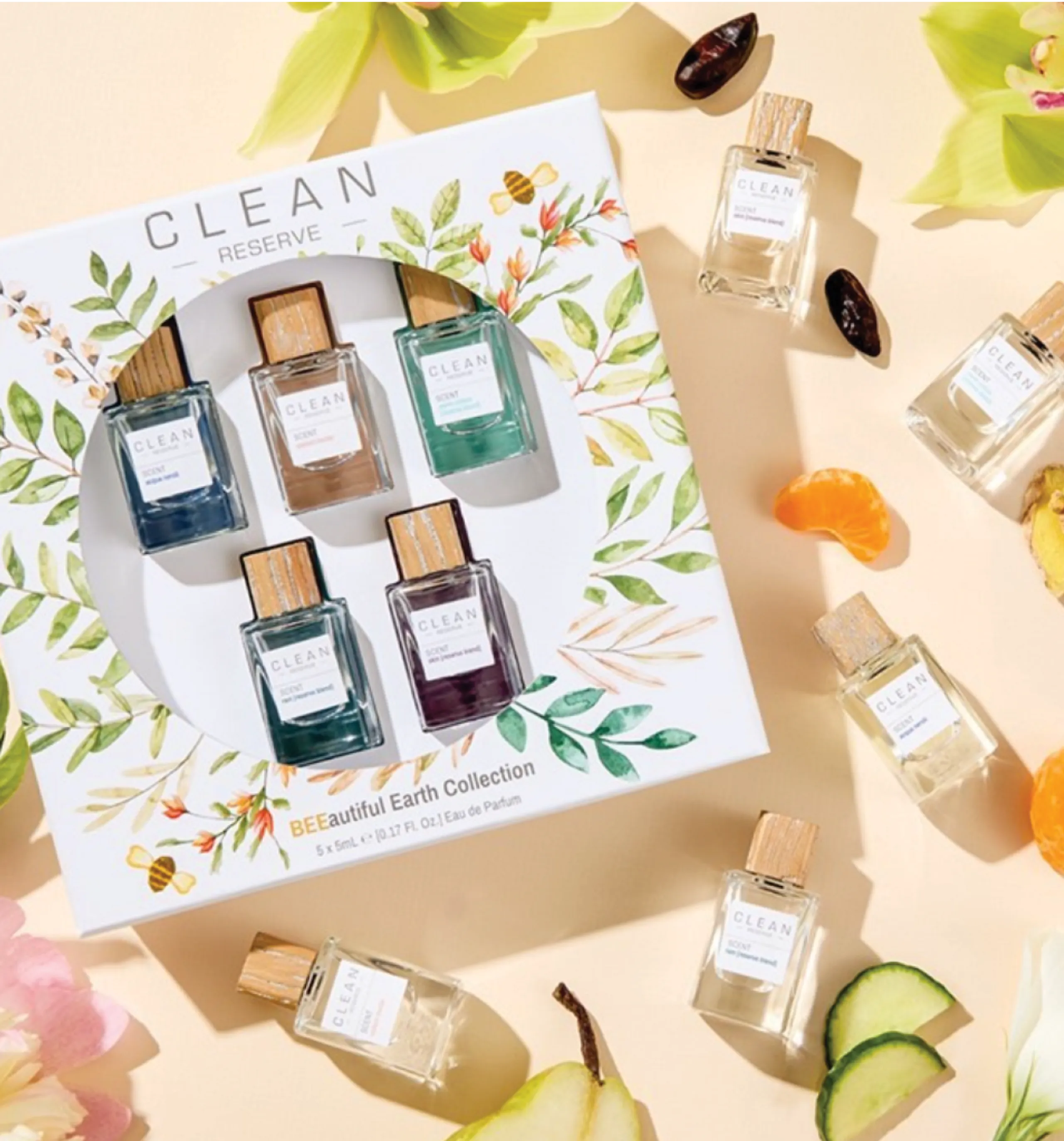
Eco-conscious & sustainable, Reserve is a farm-to-fragrance collection, and is developed with the perfumers’ reserve of fine ingredients. With that the vision for this collection is warmer and captures the essence of natural tones, warm backgrounds and deeper shadows.
The packaging furthers the story as the caps are a natural wood with each one varying from one another. The glass is a soft square with a heavier glass distribution. The branding on the label is apothecary in look and feel and natural in tone with a matte finish and blind embossing details around the frame. The only color is on the name of the fragrance which is tied to the color story on the carton.
The packaging furthers the story as the caps are a natural wood with each one varying from one another. The glass is a soft square with a heavier glass distribution. The branding on the label is apothecary in look and feel and natural in tone with a matte finish and blind embossing details around the frame. The only color is on the name of the fragrance which is tied to the color story on the carton.

THE VISION + PACKAGING CLEAN RESERVE HOME
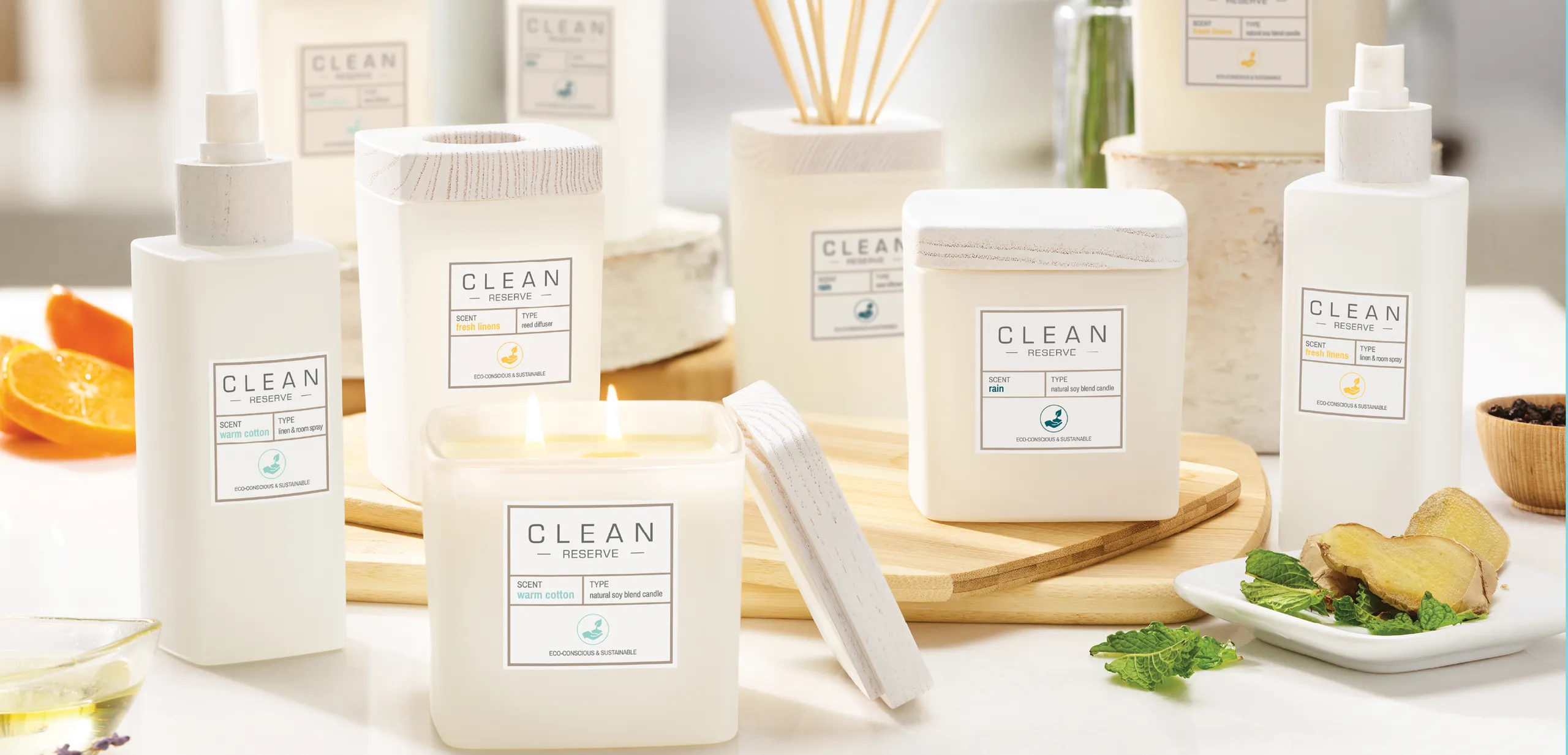
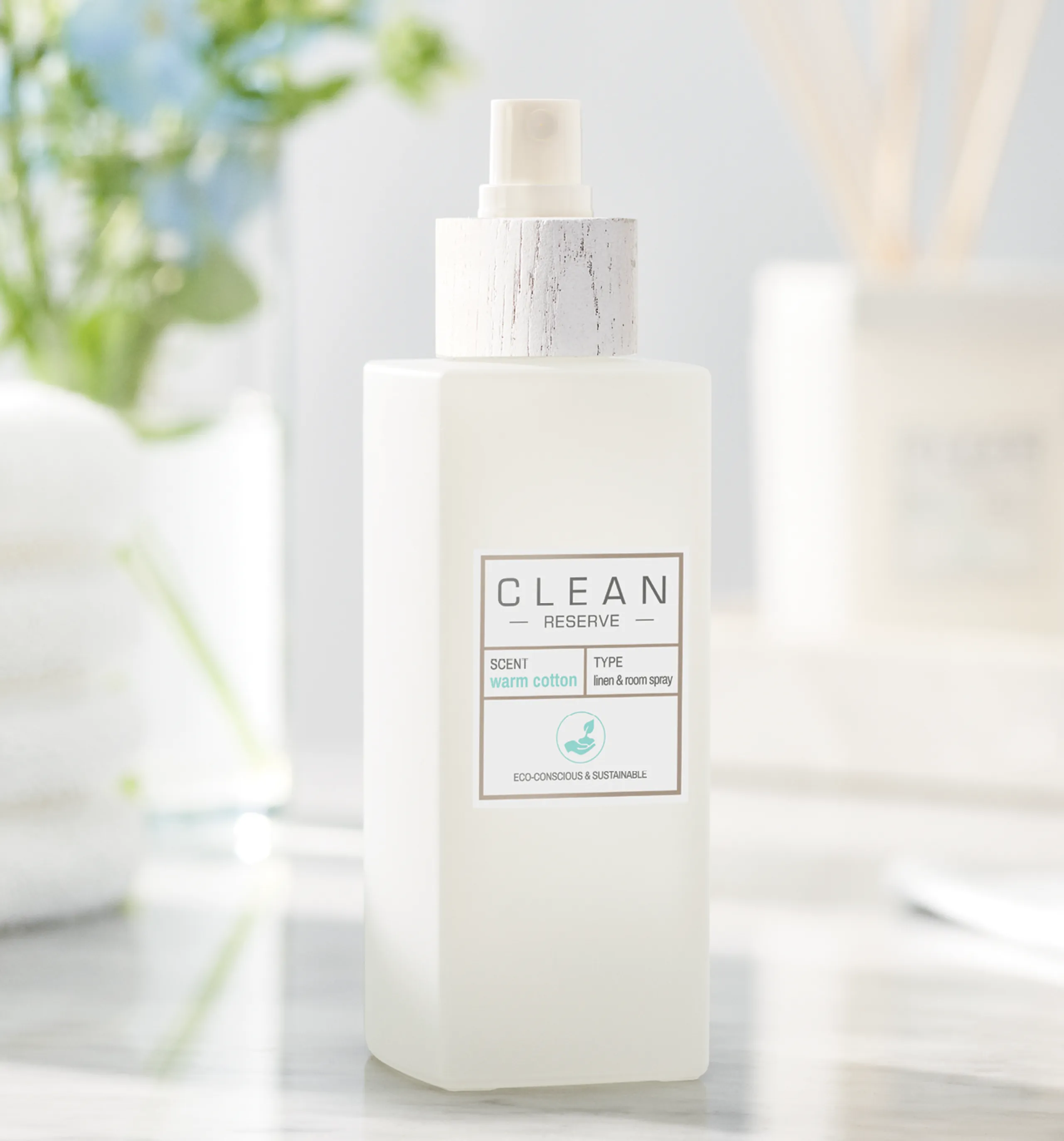
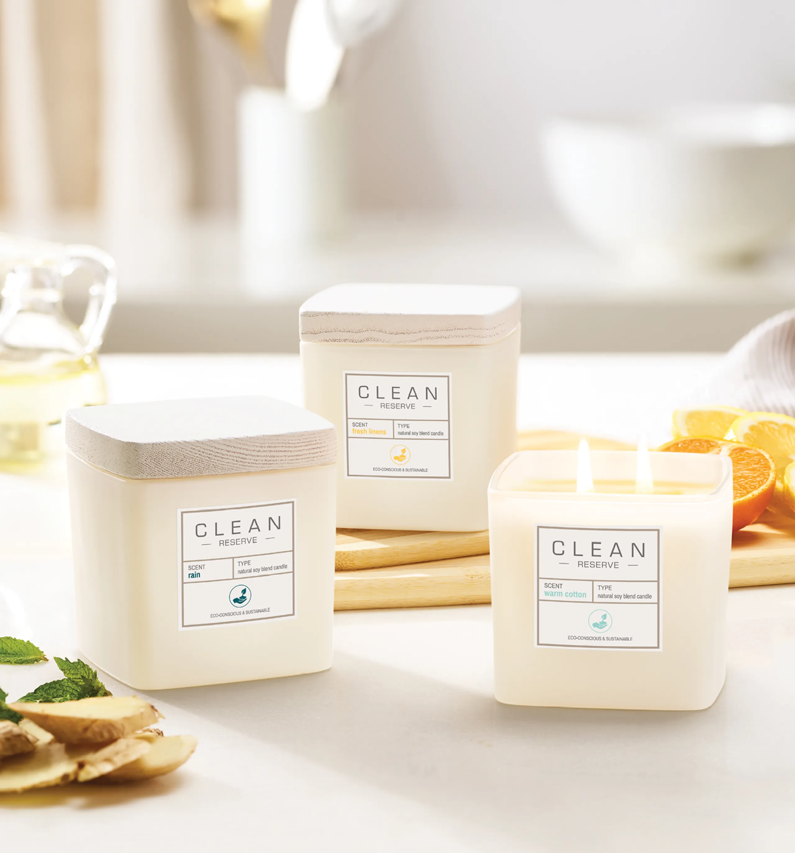
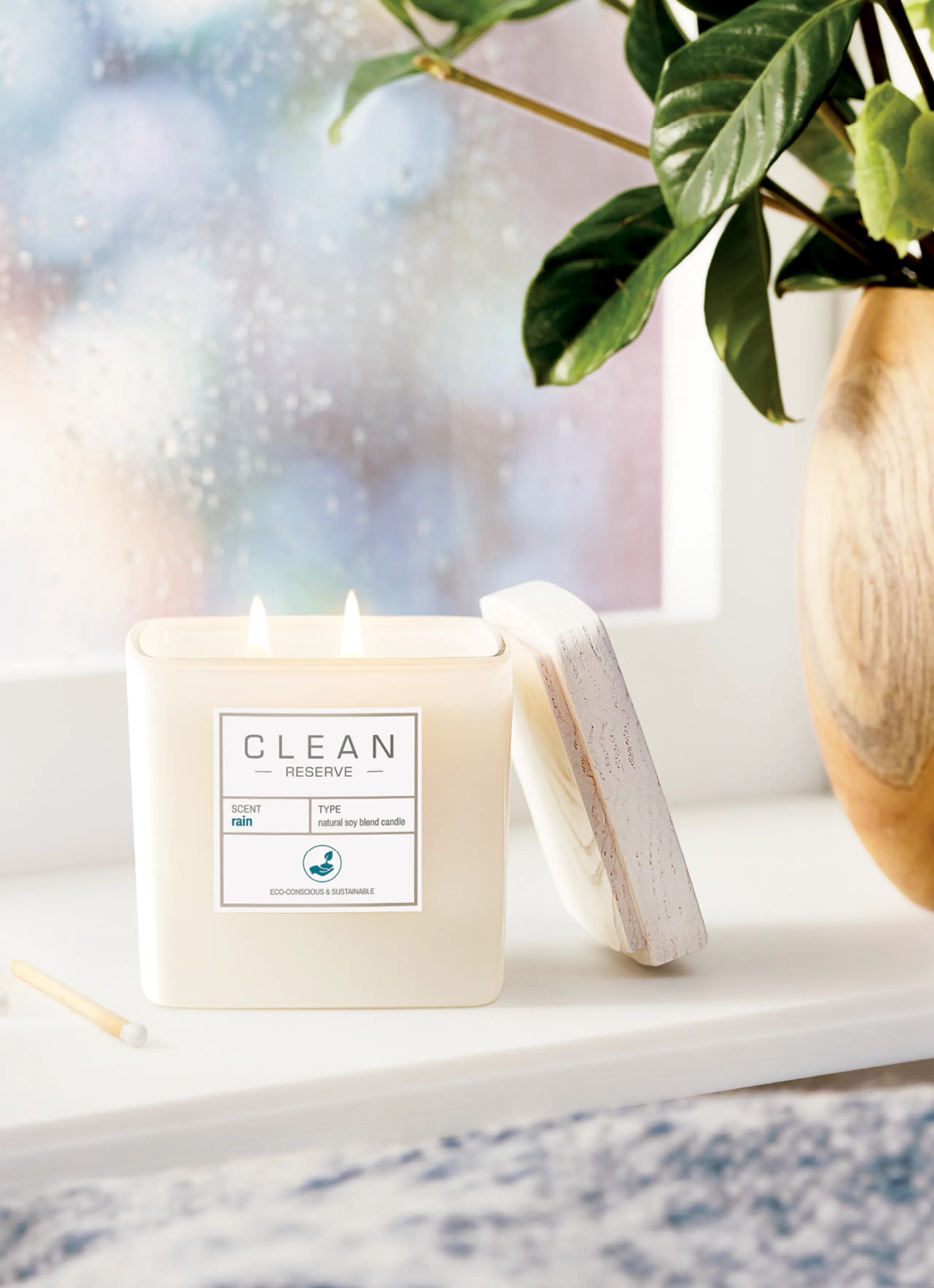
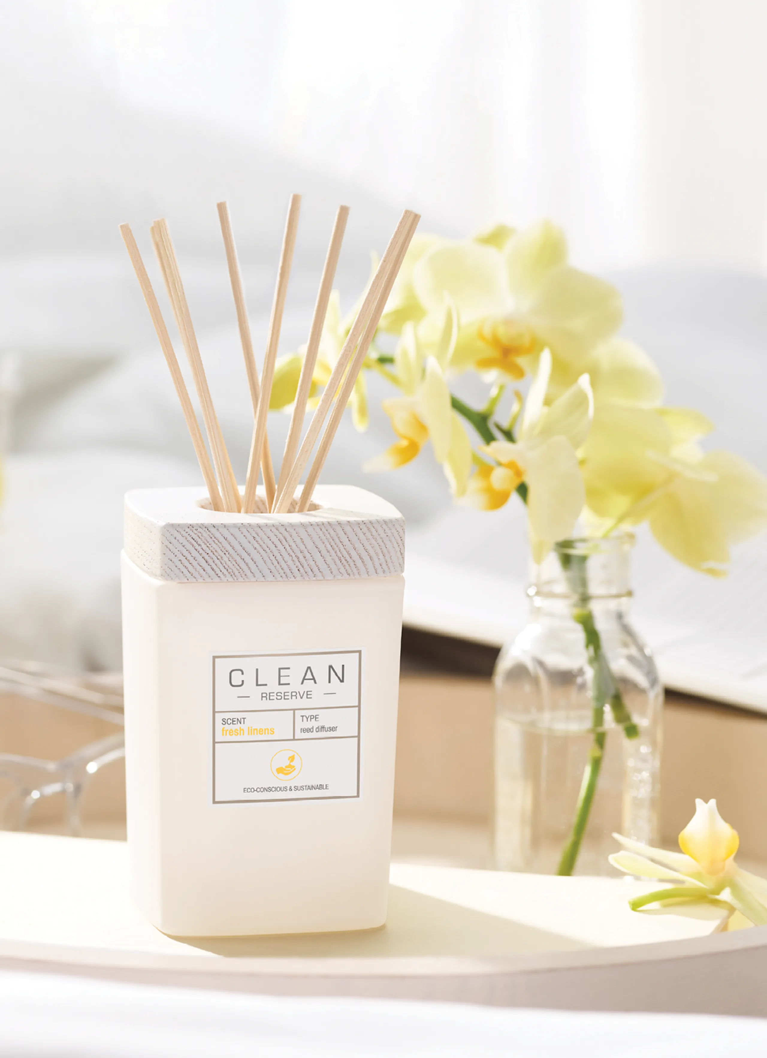
Continuing the sustainable story of Reserve, the Clean home collection is crafted with ethically sourced ingredients that play out in the three most popular Clean scents. Meant to evoke comfort, the collection is designed to seamlessly fit within a space. The vessels are a natural frosted glass topped with a white washed natural wood. The label mimics the Reserve fragrances look and feel and the graphics on the carton are color coded graphic line art that speaks to the scent and ingredients.

THE VISION + PACKAGING CLEAN HAIR & BODY
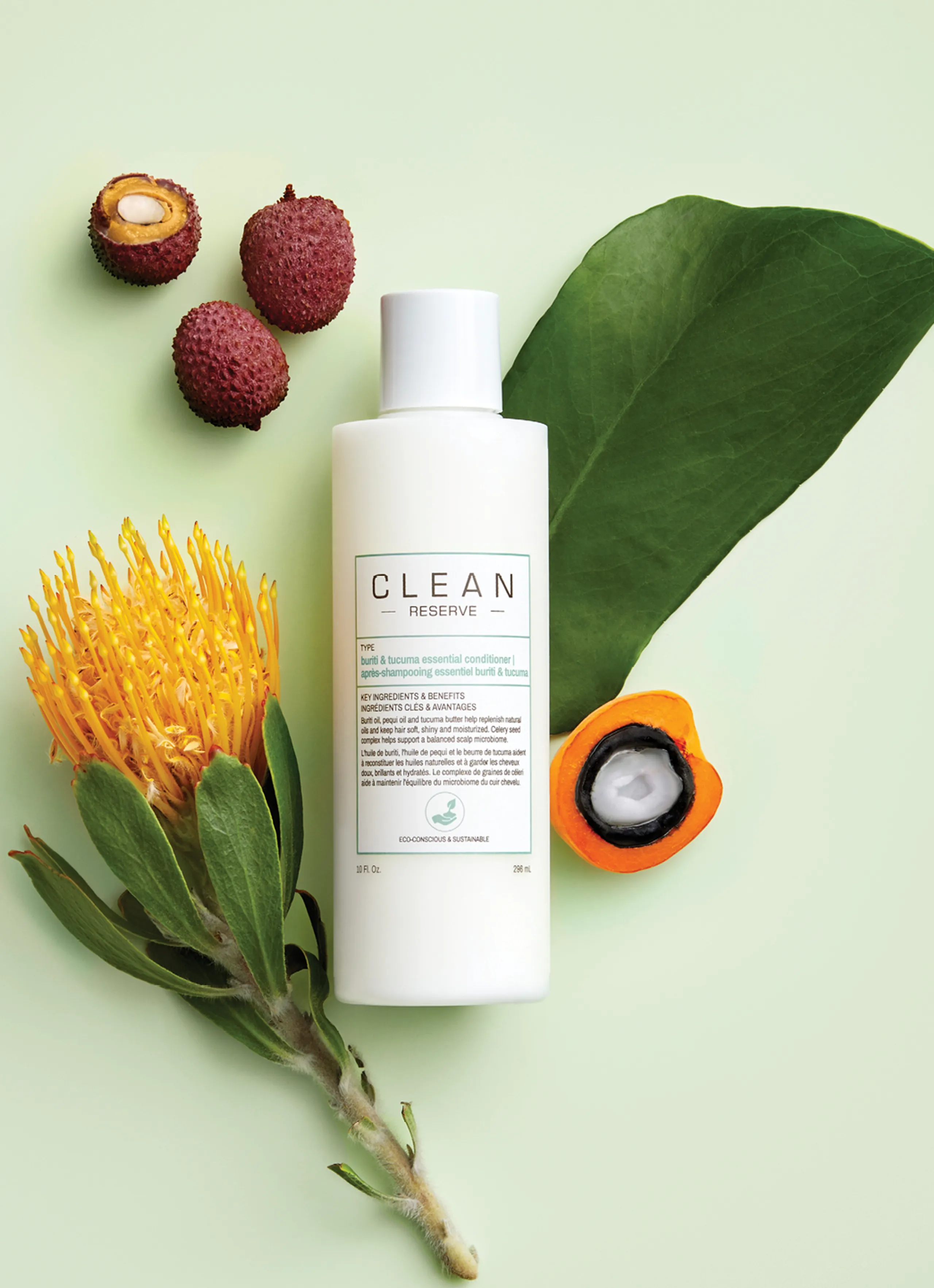
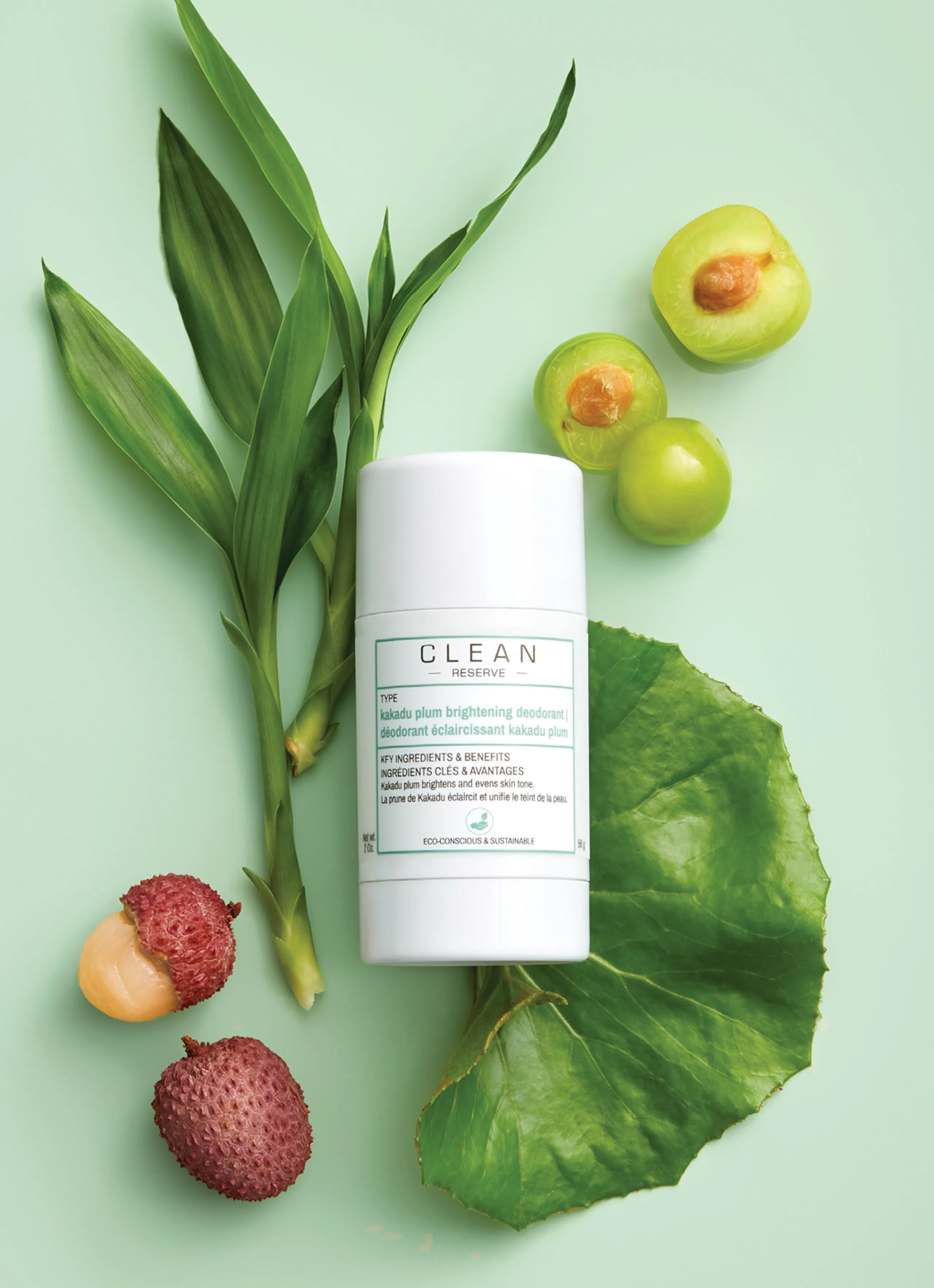
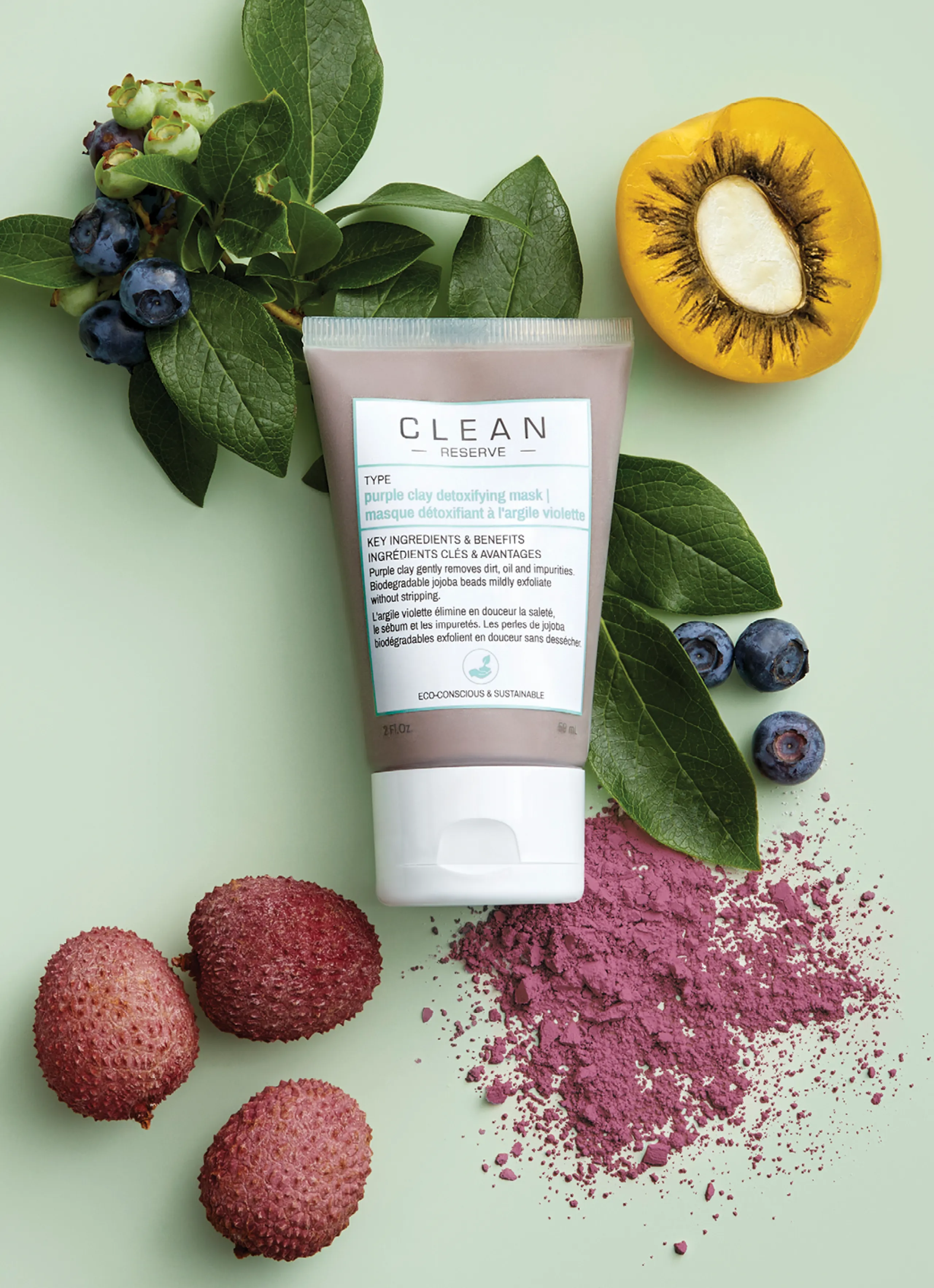
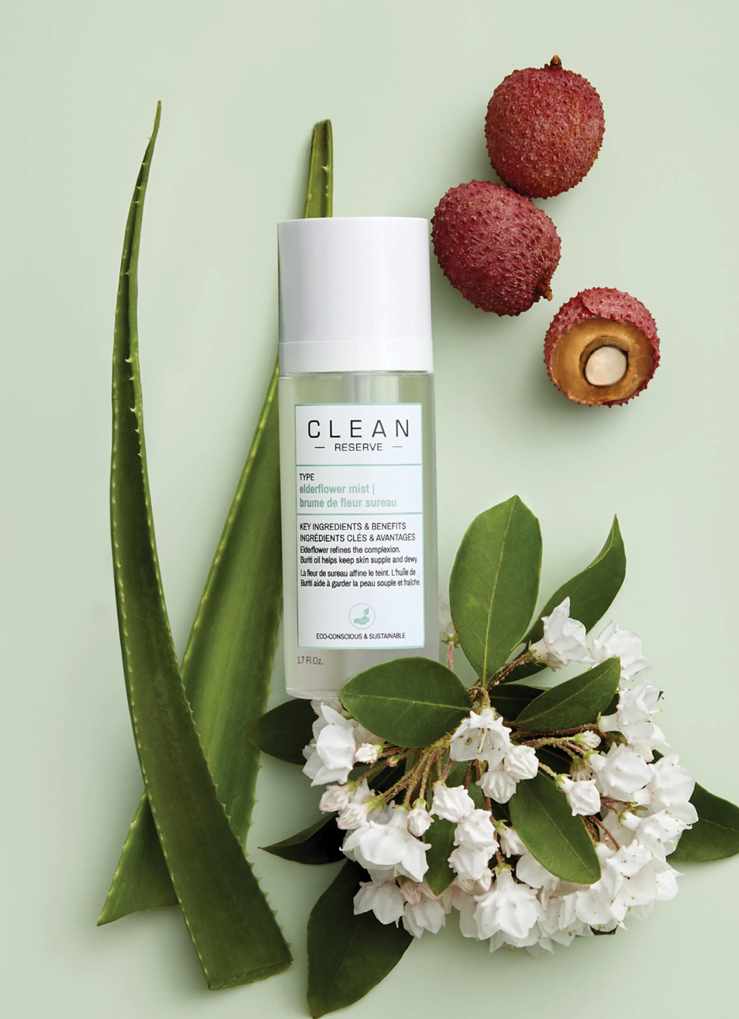
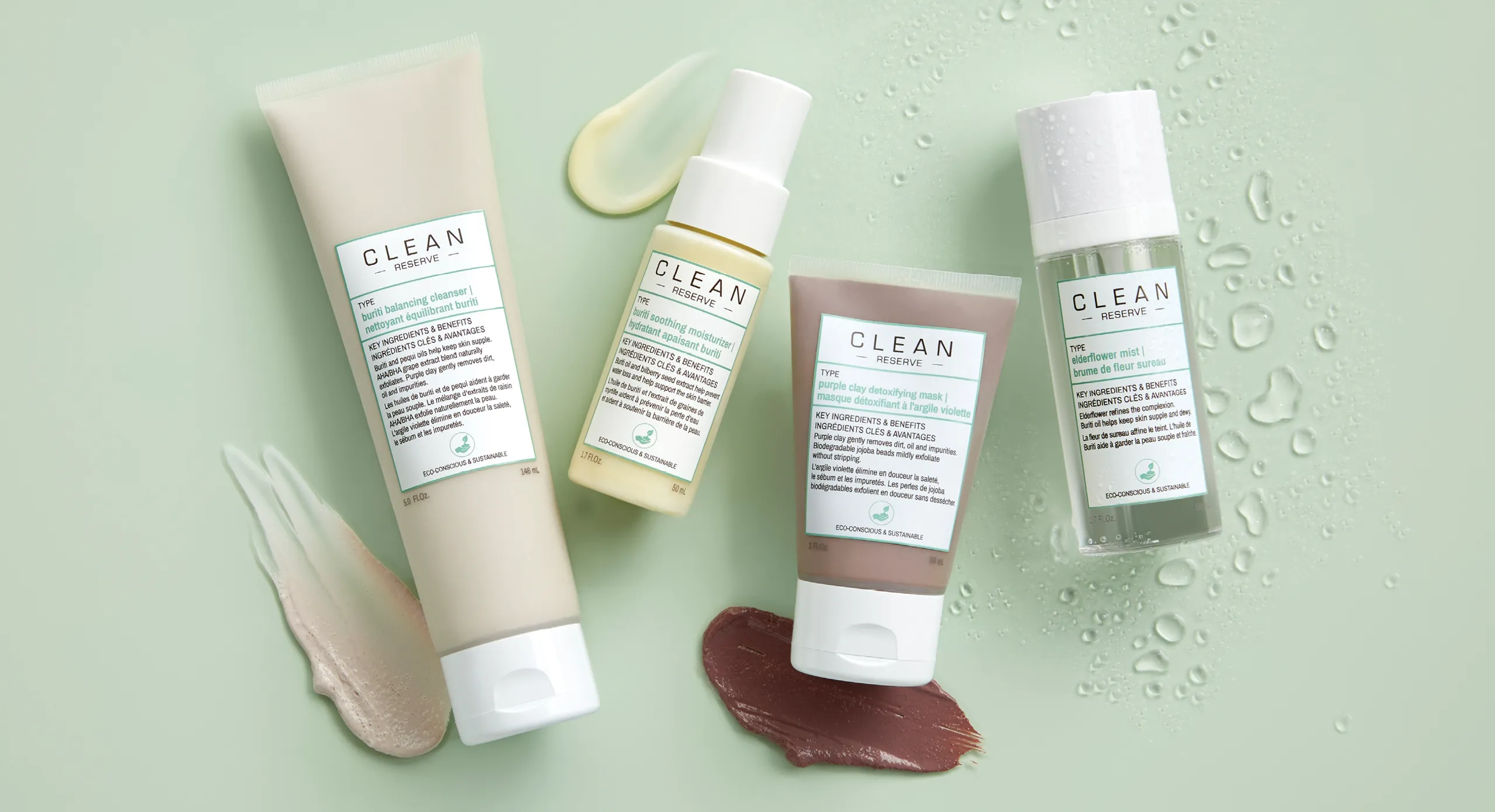
The Clean Beauty Collective expanded beyond fragrance and into hair and body. Playing off the DNA of the brand, the products are designed to be straight forward and eminate a transparancy that’s reflected in the clear, natural components, the simple white caps, and the muted green color palette. A “farm-to-formula” collection the products are infused with a blend of sustainably sourced effective botanicals. To compliment that and tie in the packaging, we designed the campaign pulling out various tones of muted green with a flat lay of ingredients creating pops of color and texture.


Logo
The corporate logo, Clean Beauty Collective, as well as the brands living under the company umbrella including, Clean Classic and Clean Reserve, are synergized picking up on the over-arching brand DNA.

