DOLLY PARTON
Cultural icon and “national treasure”, Dolly Parton, wanted to launch
her first fragrace. Without hesitation we joined forces with the team
at Scent Beauty to create this iconic beauty.
- Packaging
- Art Direction
- CONTENT CREATION
THE VISION
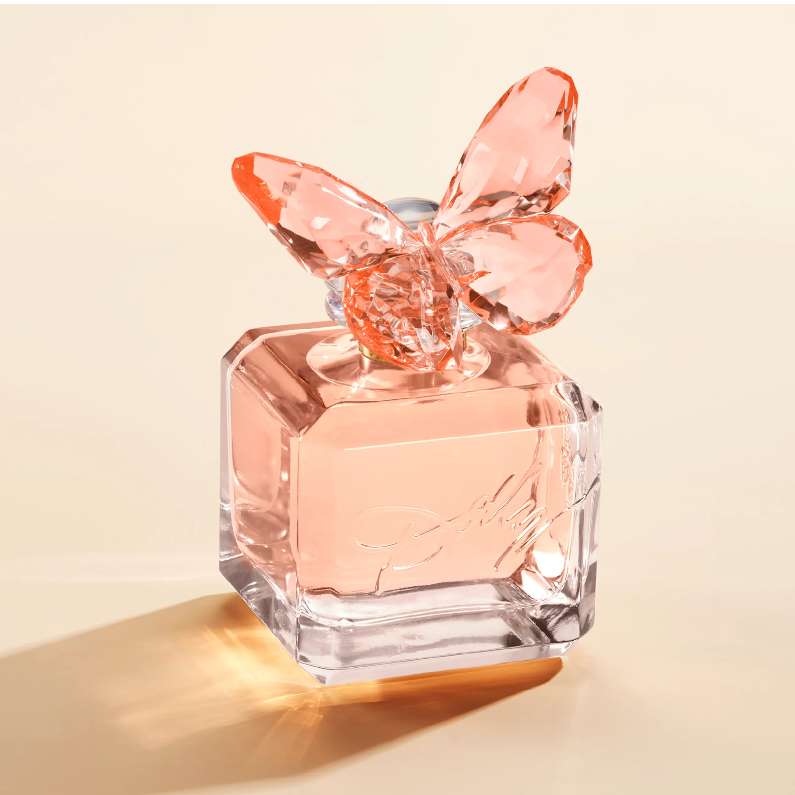
Dolly had a clear vision of what she wanted her fragrance to represent In true Dolly fashion, she wanted it to spread love and hope. Feel sparkly and airy and give people joy when they saw it. The butterfly icon has been a part of Dolly’s brand for decades and we wanted to re-interpret it in a new and innovative way
“I CALL MY DOLLY PERFUME “SCENT FROM ABOVE” BECAUSE IT IS EXCELLENTLY HEAVENLY ”
PACKAGING
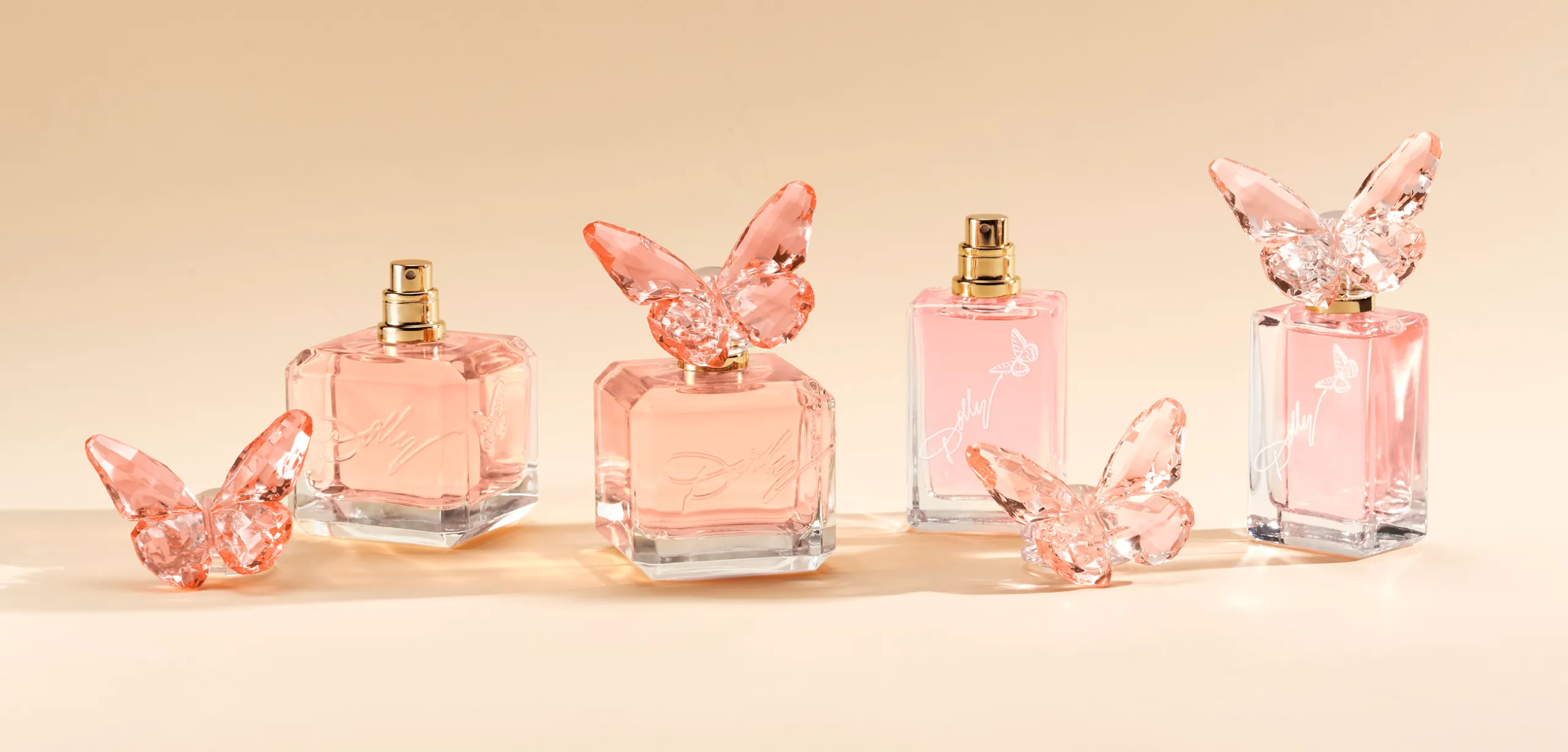
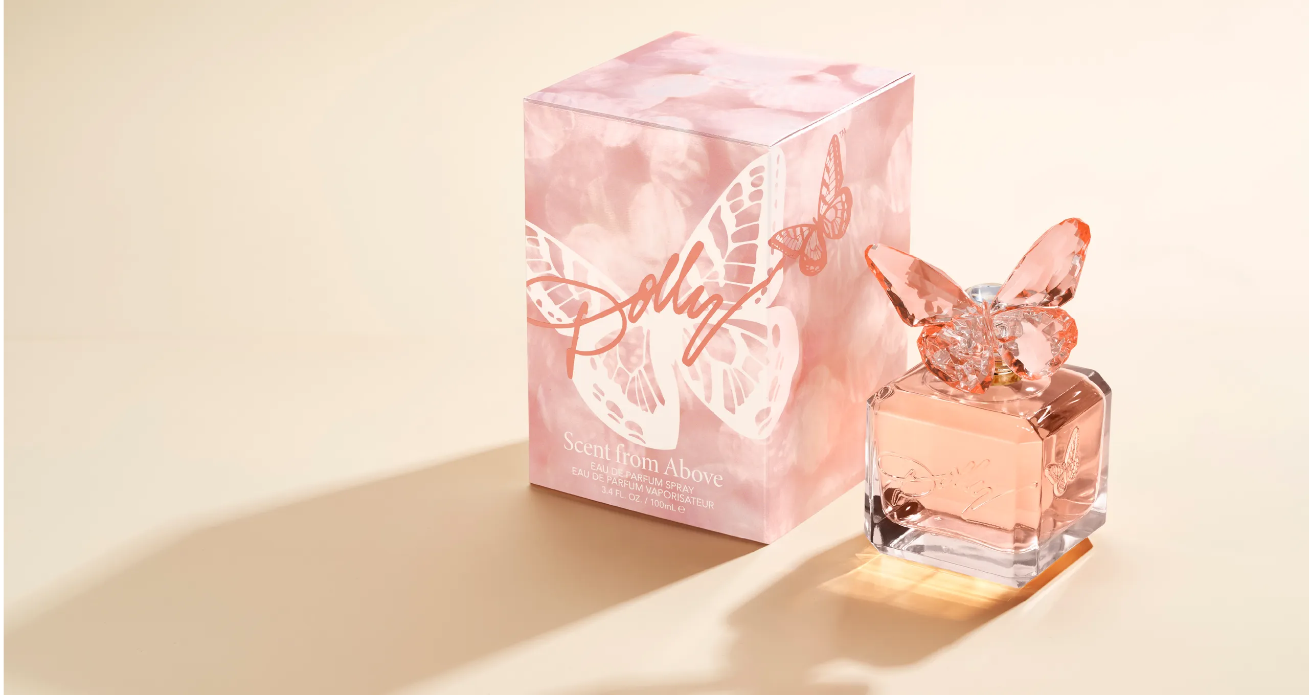
The Eau de Parfum flacon is a geometric cube with a thick glass distribution. Perched on top is a sparkly butterfly that is meant to feel like it’s just landed on the bottle. We wanted this to be sparkly and eye catching, like a Swarovski crystal. The color of the juice and cap are tonal and are inspired by Dolly’s favorite color which she calls “pinch”, a cross between pink and peach. Dolly’s logo is built into the glass mold creating a seamless branding moment that doesnt fight with the rest of the design. The carton graphics are tonal as well and create a bokeh lighting effect that’s meant to evoke sparkle and airiness and allows the butterfly logo and icon to be the focus.
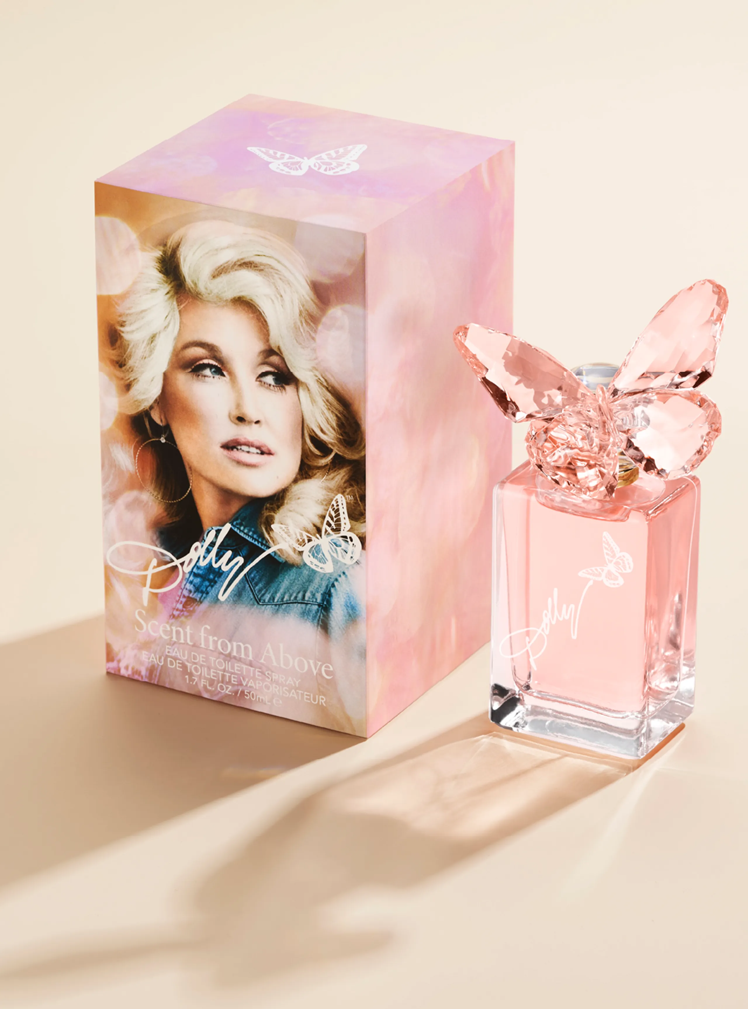
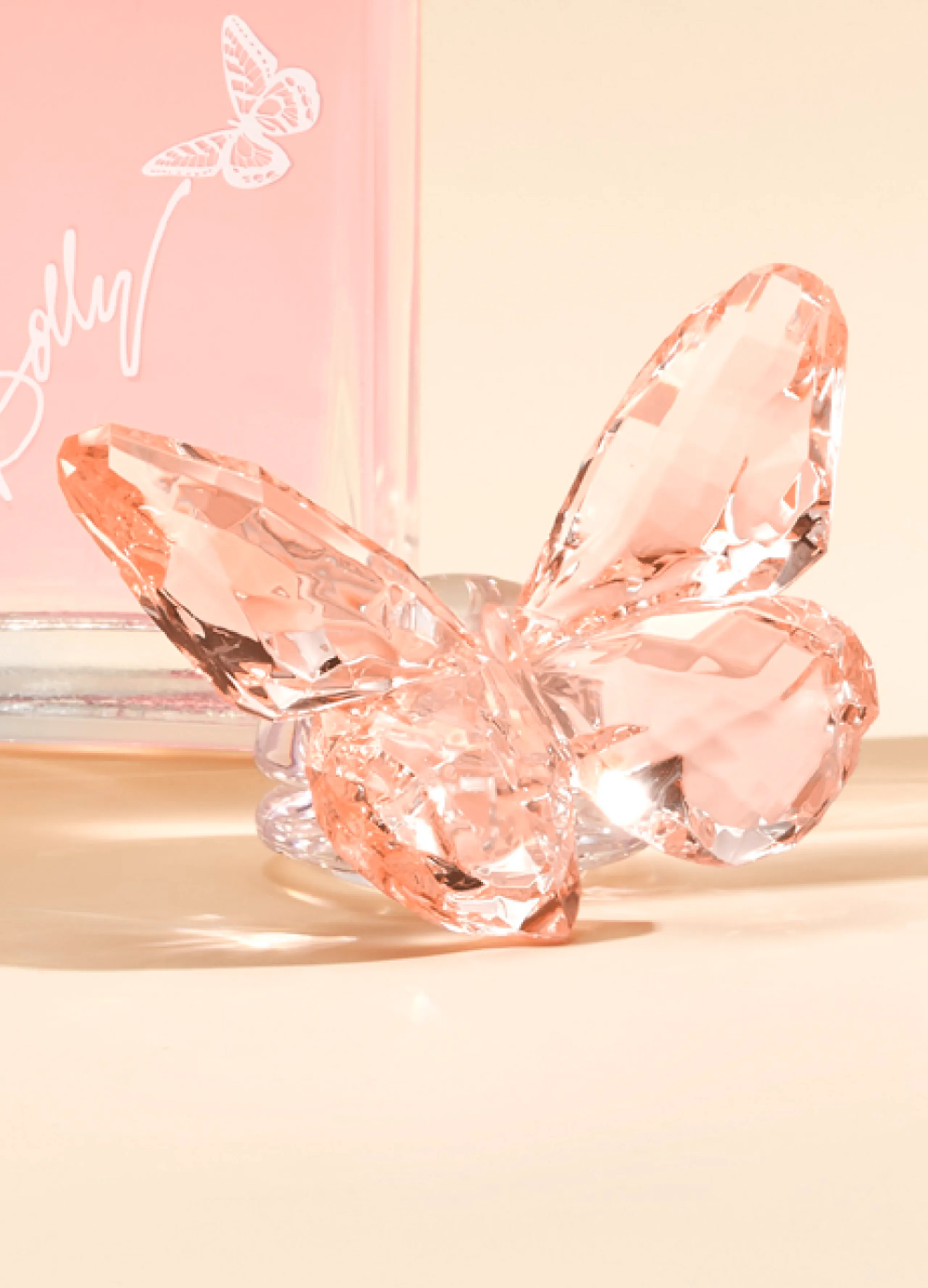
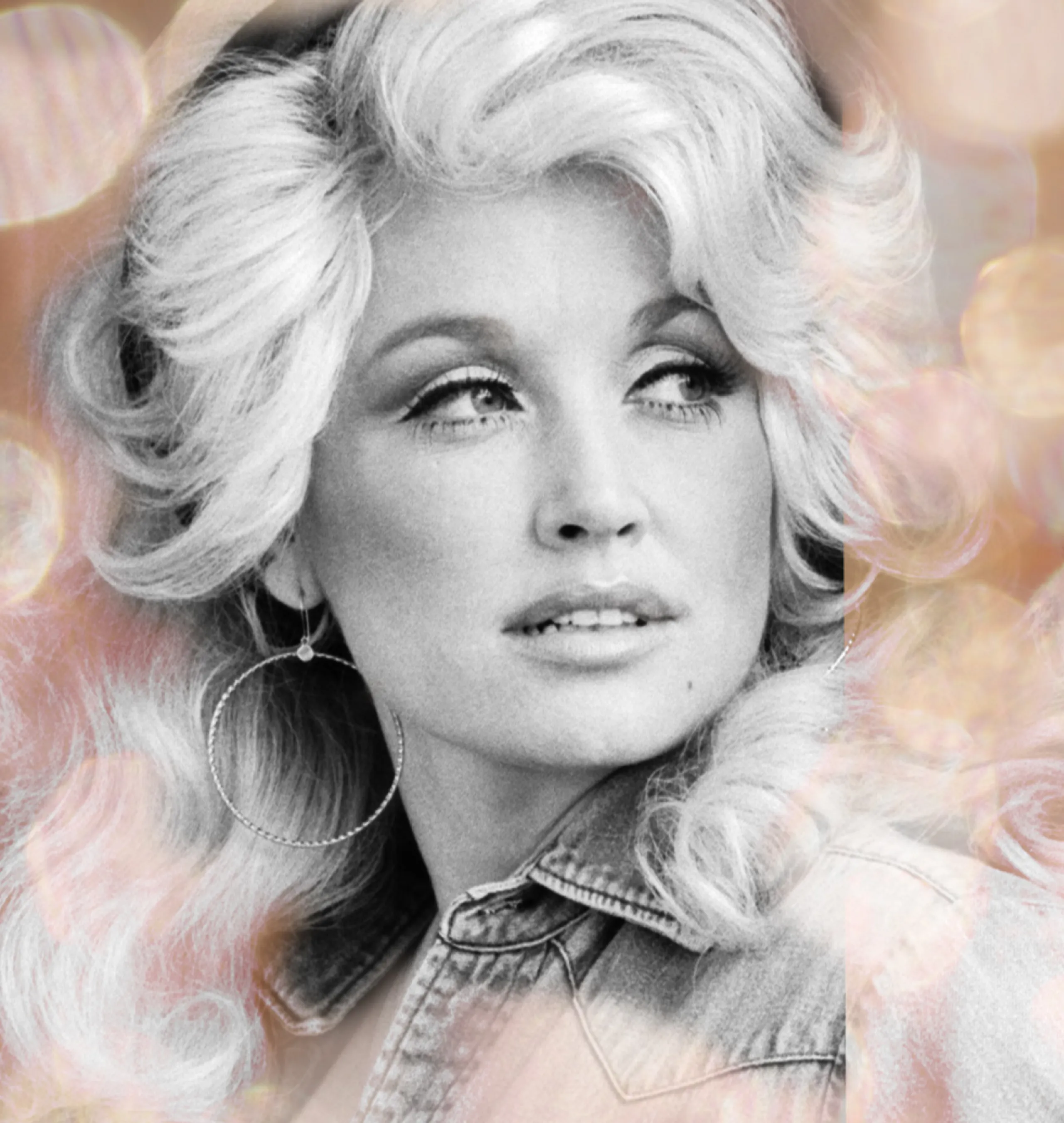
The EDT bottle takes the geometric cues from the EDP’s signature details while adding height to the glass. The coloration varies slightly with more hints of pink throughtout. The carton features Dolly’s image with a transparant bokeh pattern.
DIGITAL CONTENT
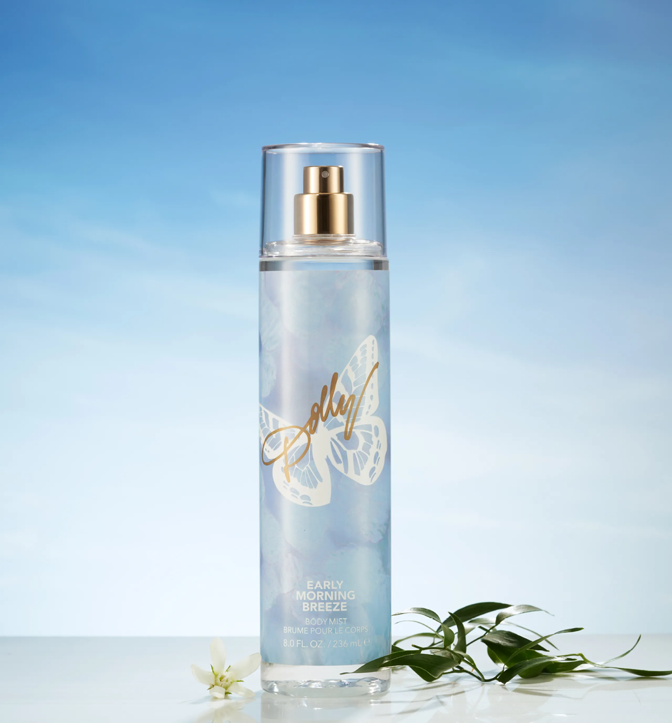
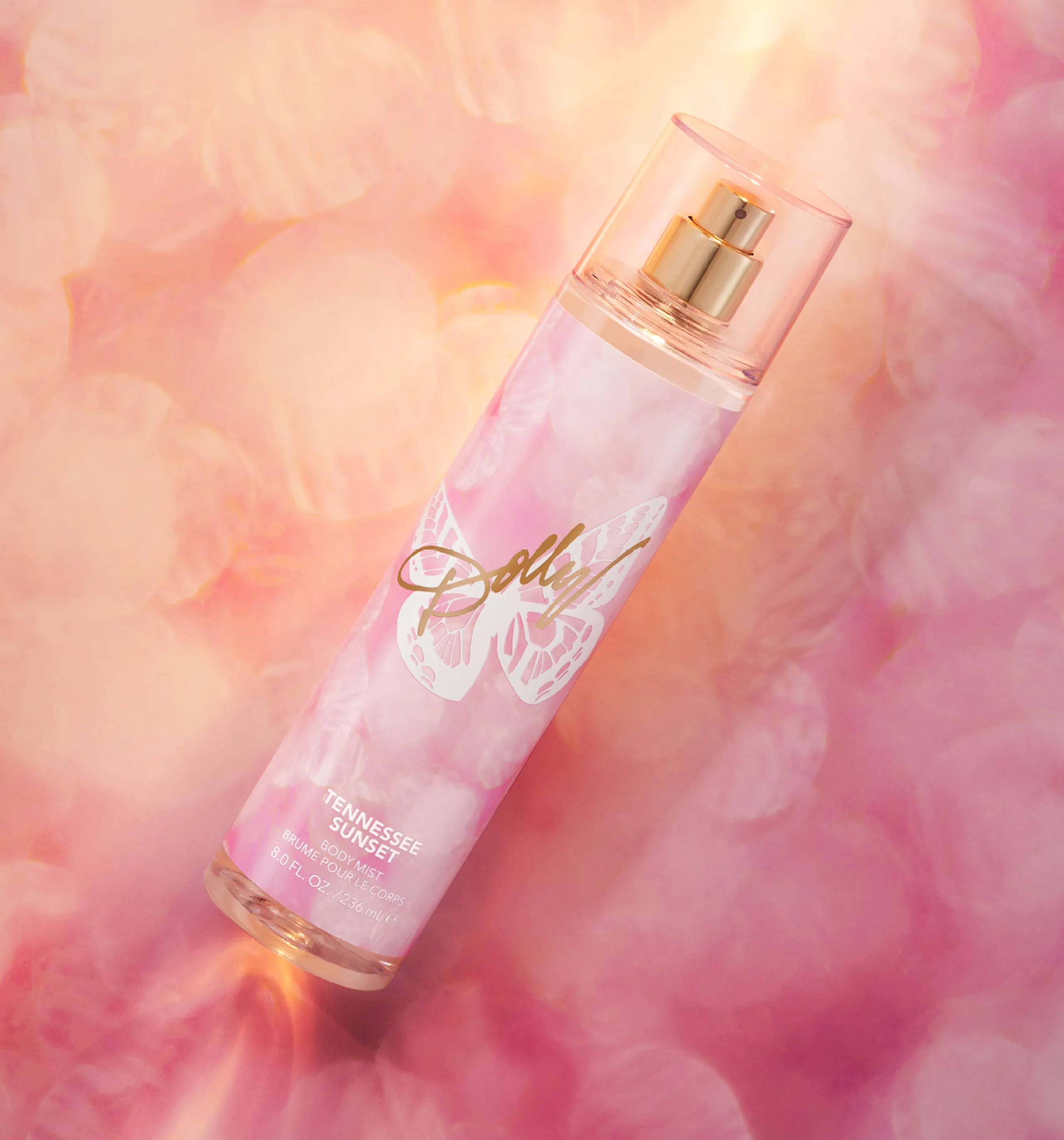
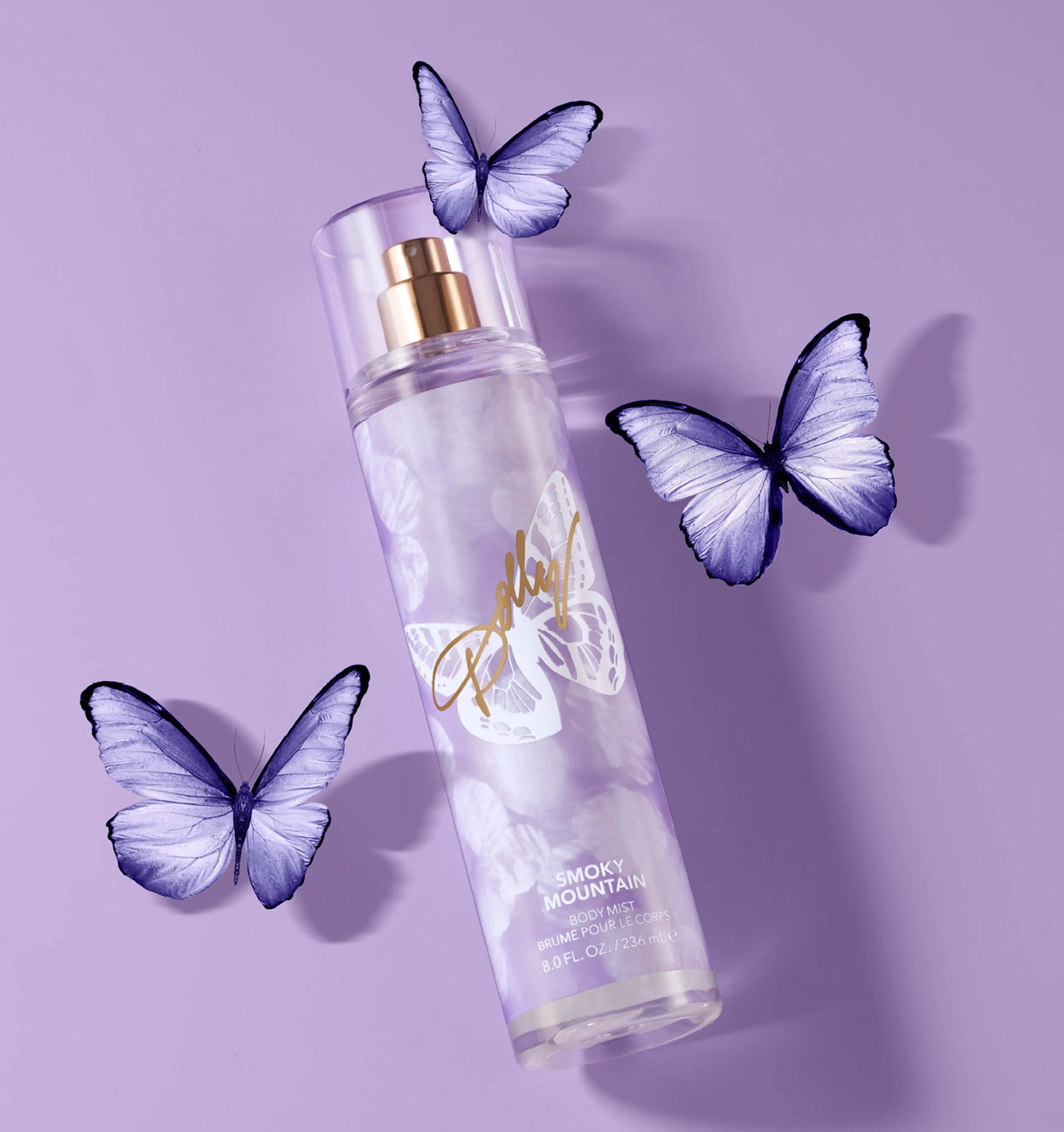
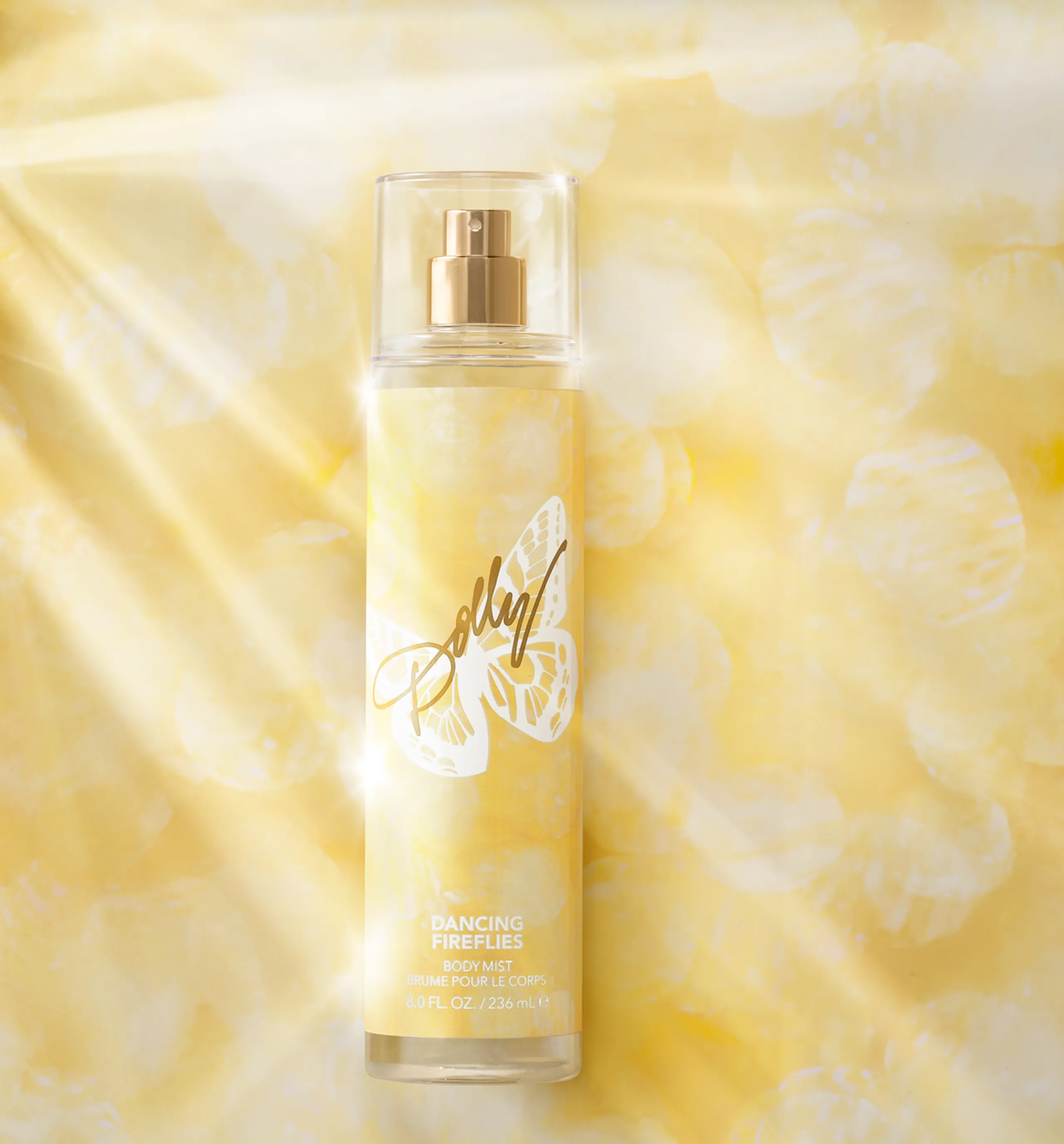
Using the bokeh pattern that is strung throught the EDP and EDT carton design, we designed a collection of body mists called “Front Porch” and created a digital content campaign featuring the various colors and ingredients for each flavor.

