AEQIUM
We were approached by Italian based founders, Francesco Balestrieri and Alla Reitsma to create a skincare line. Both have worked in the pharmaceutical industry for over 20 years. In collaboration with a physician and partnership with JMD’s expertise of the luxury beauty space, they now wanted to take all that knowledge to create an efficient, high end Italian skincare brand that evokes efficacy, luxury and balance through a holistic skin system.
- Brand Identity
- Packaging
- Art Direction
- CONTENT CREATION


THE VISION
Taking inspiration from it’s Italian heritage, we aimed to create a line that projected, elegance, beauty, health and balance.


SCIENTIFIC HEART, MEDITERRANEAN SOUL.

PACKAGING
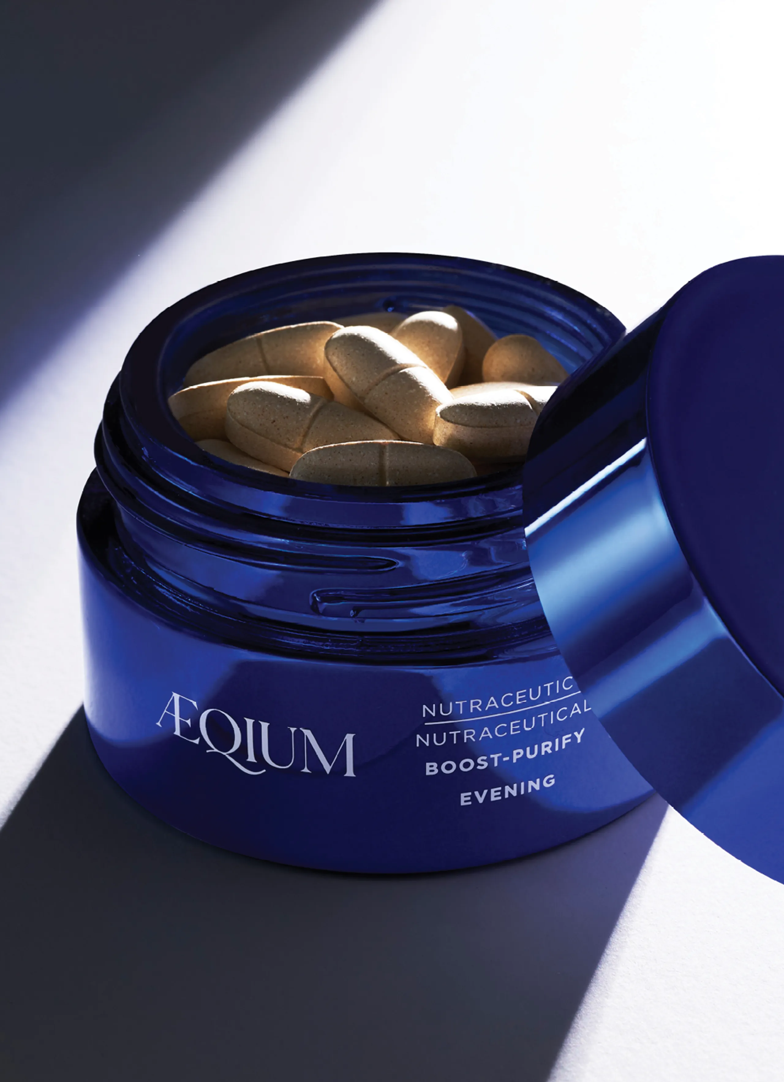
To evoke luxury and efficacy, we focused on the forms first. The simplicity of heavy healed tall glass cylinders paired with short glass jars created a beautiful and eye catching visual landscape. With the brands strong Italian roots in mind, we also took the colors of the Meditarranean into account bringing in tones of rich ocean blue’s and crisp whites. The finishes on all primary products are metallic and create a beautiful reflective surface much like the sea. In contrast, the secondary’s are an uncoated SBS board with hits of blue and gold metallic.

LOGO
Using a modern sans serif font that felt both traditonal and contemporary was important for the brand’s visual communication. Complementing the logo is an icon that took cues from the letter “Q” to create strong brand recogniton even when used without the logo.


